.png)
I interviewed 3 GP doctors and nurses to understand the goals for the GP practice's website and get insights about their typical patients. I conducted a semi-structured interview with them for 10 minutes during their lunch break and analysed the transcripts for key insights. Here's what I learned:
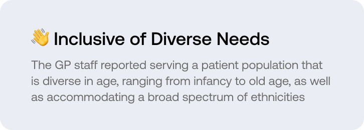
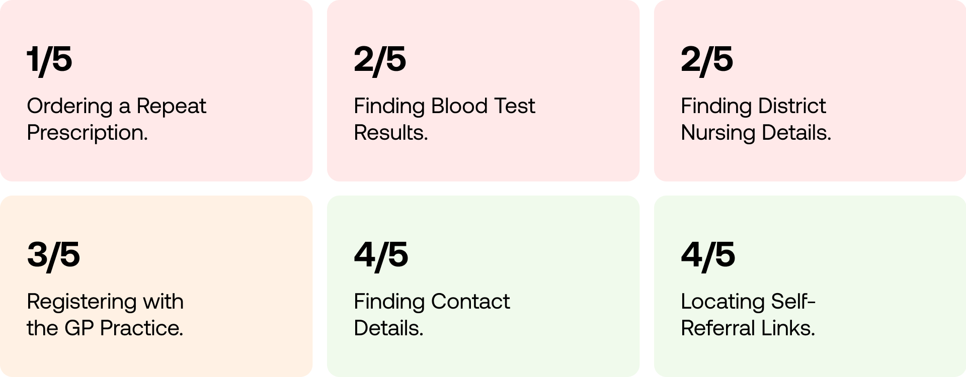
I conducted unmoderated usability tests on the Modern Medical Centre website, where 5 participants from the United Kingdom aged 18-50 years old, were asked to complete 6 typical use cases on GP websites. The participants were chosen to be diverse in age and from different backgrounds, to reflect the diverse nature of GP patients. After they completed the tasks, they were asked to rate their overall experience with the site using SUPR-Q inspired questions. We asked the users to do the following tasks - (1) Registering (2) Order Repeat Prescriptions (3) Finding Home Visit Information (4) Checking Blood Results (5) Contact Details, and finally, (6) Finding self-referral links.
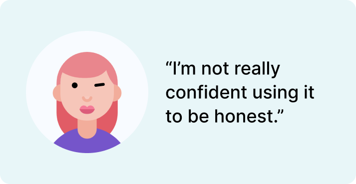
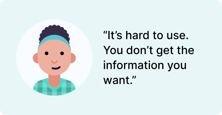
Following the usability testing, I transcribed and documented the recordings by highlighting notable quotes and observing user behaviour.
Below is a summary of what tasks were the easiest to complete and the hardest. The crucial issue with the website is that navigation. Users found it difficult to locate certain actions like ordering repeat prescriptions, finding lab results and finding district nursing details. Despite this, it excels in displaying contact information and facilitating registration processes.
I utilised SUPR-Q-inspired questionnnaire using a 5-point likert scale to measure the overall aesthetics, trustworthiness, and user experience. The method allows for easy comparison before and after a website redesign - and provides opportunity to compare against others. I distributed the questions:
Rate from a scale from 1-5
- This website is easy-to-use.
- It is easy to navigate within the site.
- The information on the site is credible.
- The information on the site is trustworthy.
- I find the website to be attractive.
- The website has a clean and simple presentation.
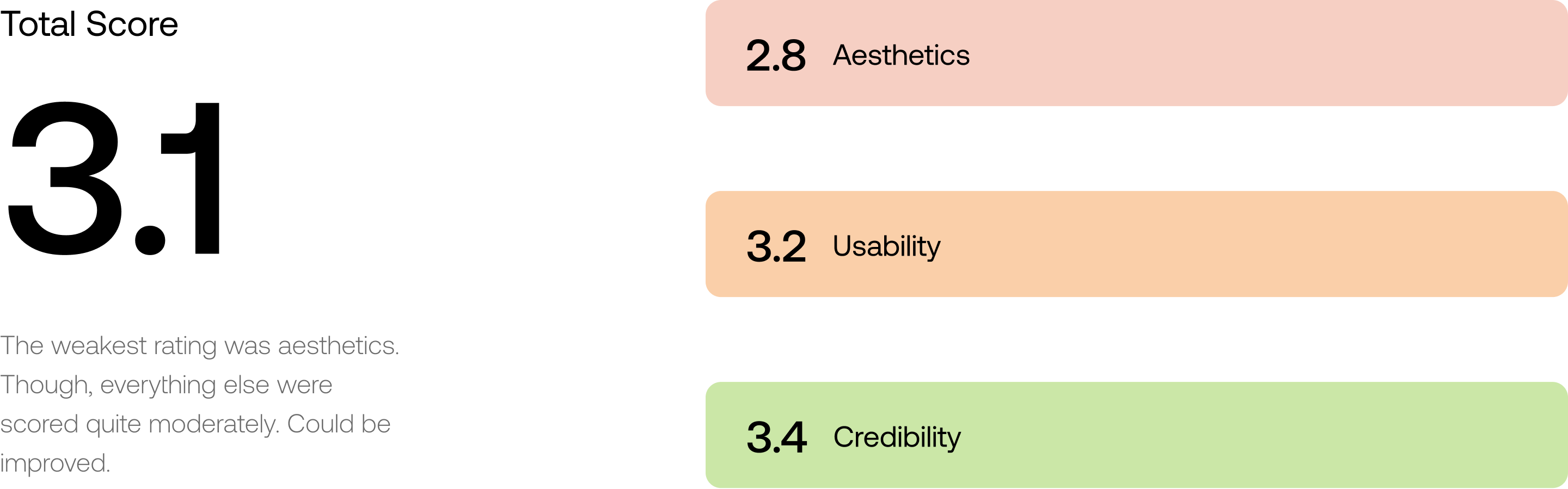
The GP surgery received an overall raw score of 3.1 or the equivalent of 62.5%, which is not poor but has room for improvement. (50% being the average). The weakest score was in aesthetics, which was significantly low, indicating that the design needs improvement.
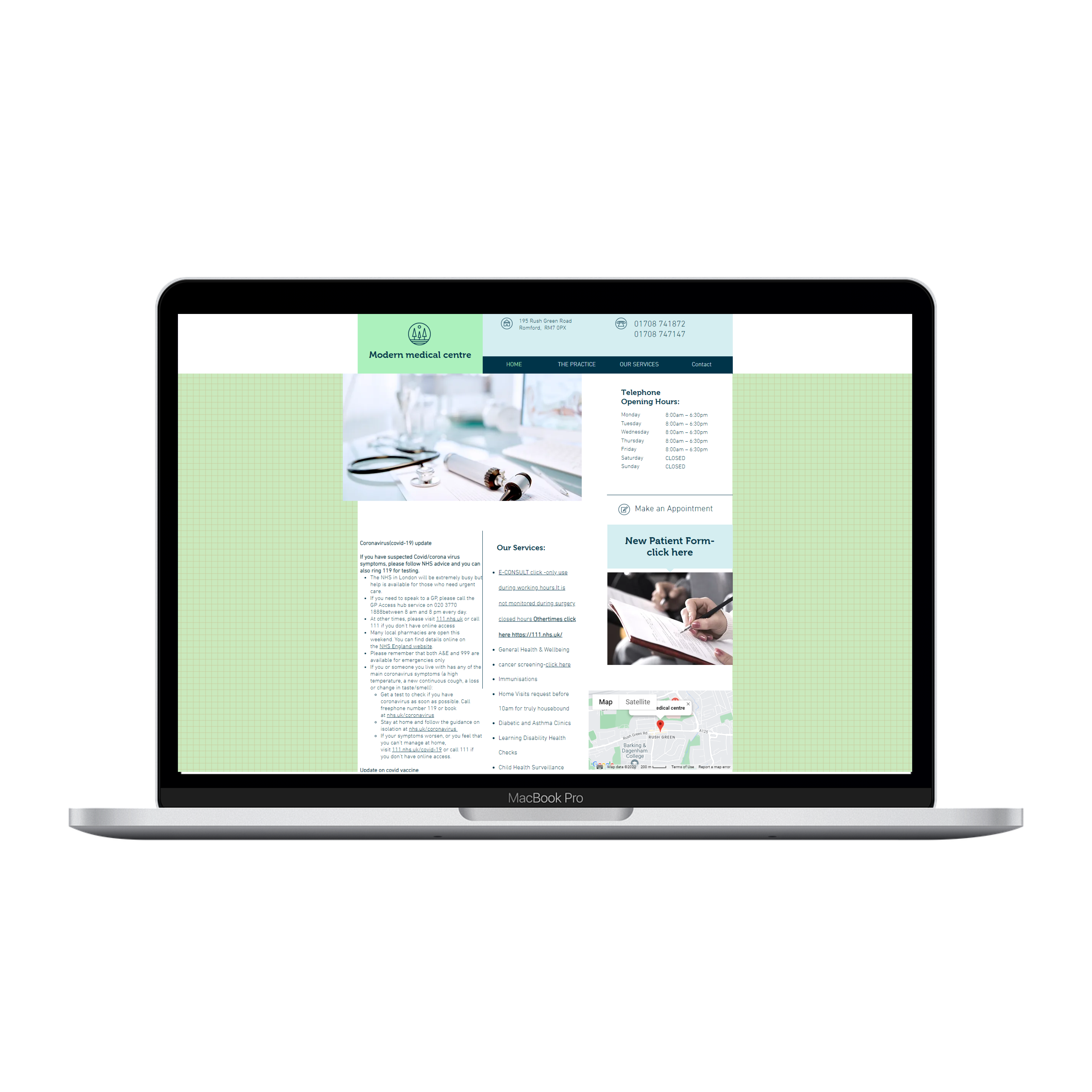
Users who have a frustrating user experience are more likely to abandon the site. For example, the website offers different features, but their whereabouts are confusing which will make the user "guess" where they are. Users will stop using the website as a result, negatively affecting it.
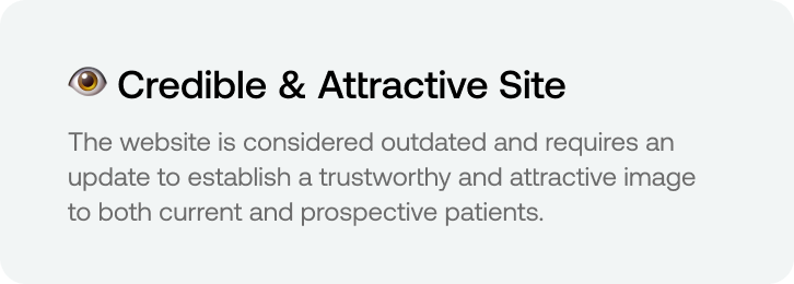
Due to the usage of stock photos and the overall design, some participants felt that the website did not look very appealing or legitimate. As a result, the GP suffers and patients have unfavourable expectations as a result of this.
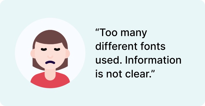
The website's formatting is uneven. Some items resemble "buttons," but cannot be clicked. Moreover, typefaces and sizes are inconsistent, which can be aesthetically misleading for users and lead to mistakes from patients.
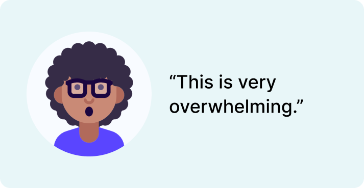
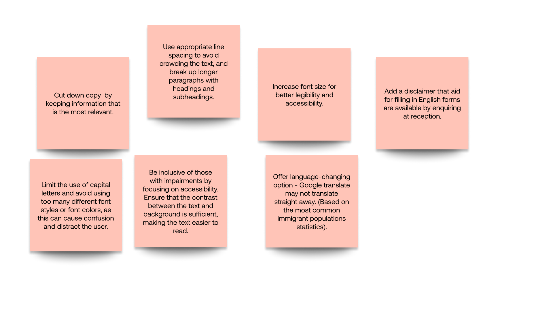
According to research, people think the website is too "overwhelming" because of how much information is presented on each page. As a result, there is insufficient line spacing or the omission of unnecessary information. As a result, users can quickly skim over crucial information.
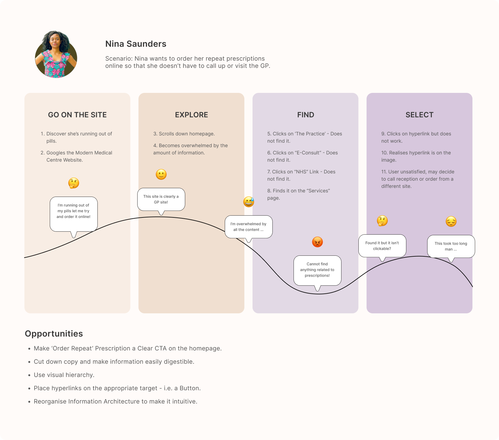
I created three user personas to ensure that all user requirements and scenarios were taken into account. To accompany the personas, I made three user journeys that depict the steps a user would take to complete their designated task in order to better grasp the scenarios and emotionally connect with each user - as well as find points where the site needs to be changed.
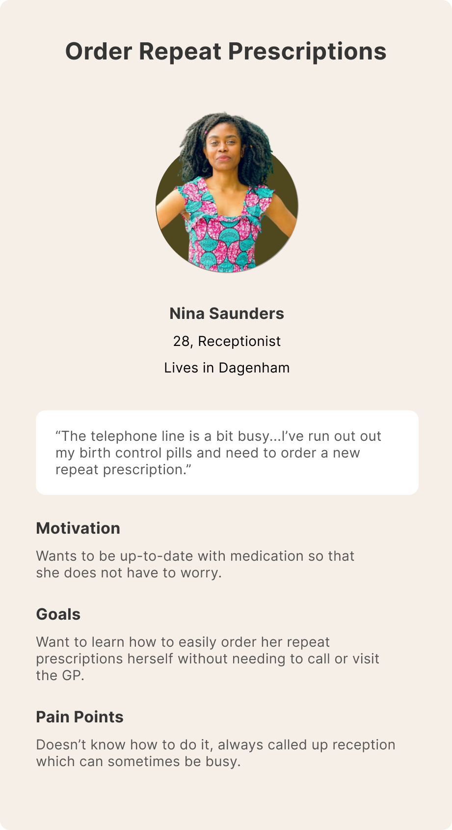
1. A young adult female who wants to order a repeat prescription.
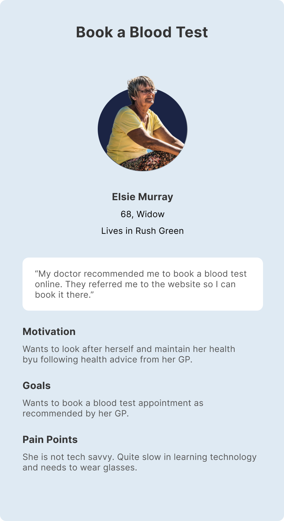
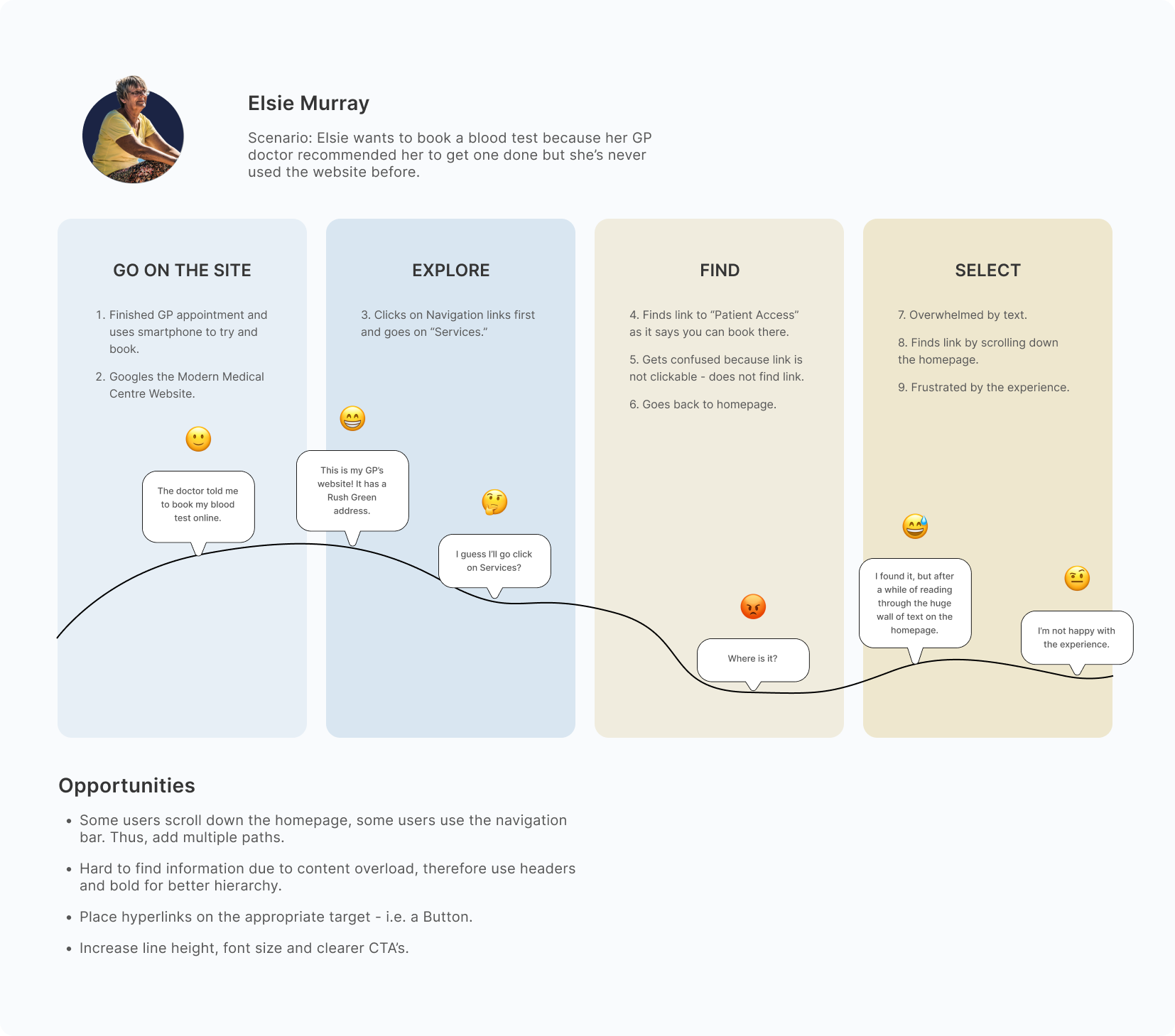
2. An older woman who is not tech-savvy and wants to book a blood test.
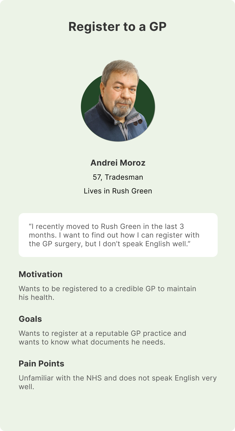
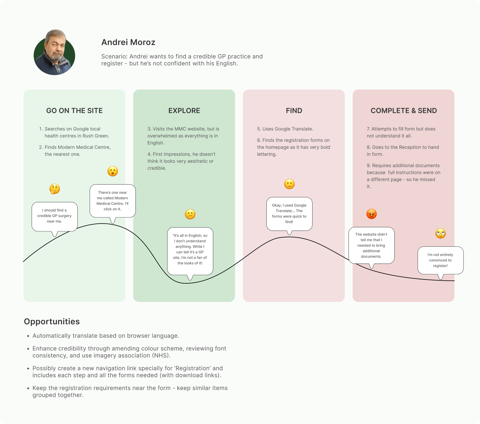
3. An older man who has recently relocated to the UK and wants to register with a trustworthy GP practice.
User journeys help me to better understand the individual experiences of each user persona. By delving deeper into the problems of each step of the process, it can help me find opportunities for improvement.
I developed three user personas to ensure that all user requirements and scenarios were taken into account. The personas helped me focus on user needs and justify design choices.
The most critical issue is 'Navigation' as it blocks the user flow. There is a lack of cues to indicate that the navigation link is the right page they're looking for. So users will likely jump from one page to another - causing cognitive overload and reduced engagement. Insufficient "information scent" can cause users to abandon their search.
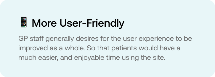
Lack of visual hierarchy (using bold titles) and inconsistent design were the most prevalent problems (i.e. buttons, typefaces, colours). This had an impact on user experiences since it caused patients to inadvertently click on the wrong buttons, miss essential information, and—more importantly for the GP—have a poor opinion of the practice.
It is hard to engage because there is too much information packed onto the site, this can cause users to abandon the site or take longer to find their desired action. We also discovered that the site might not be optimized for other languages, which can also disengage non-English speaking users.
After identifying the user needs, I wanted to start generating ideas for potential solutions that could be included in the redesign of the website. To do this, I created a series of "how might we" statements that serve as prompts for new ideas for site designs.
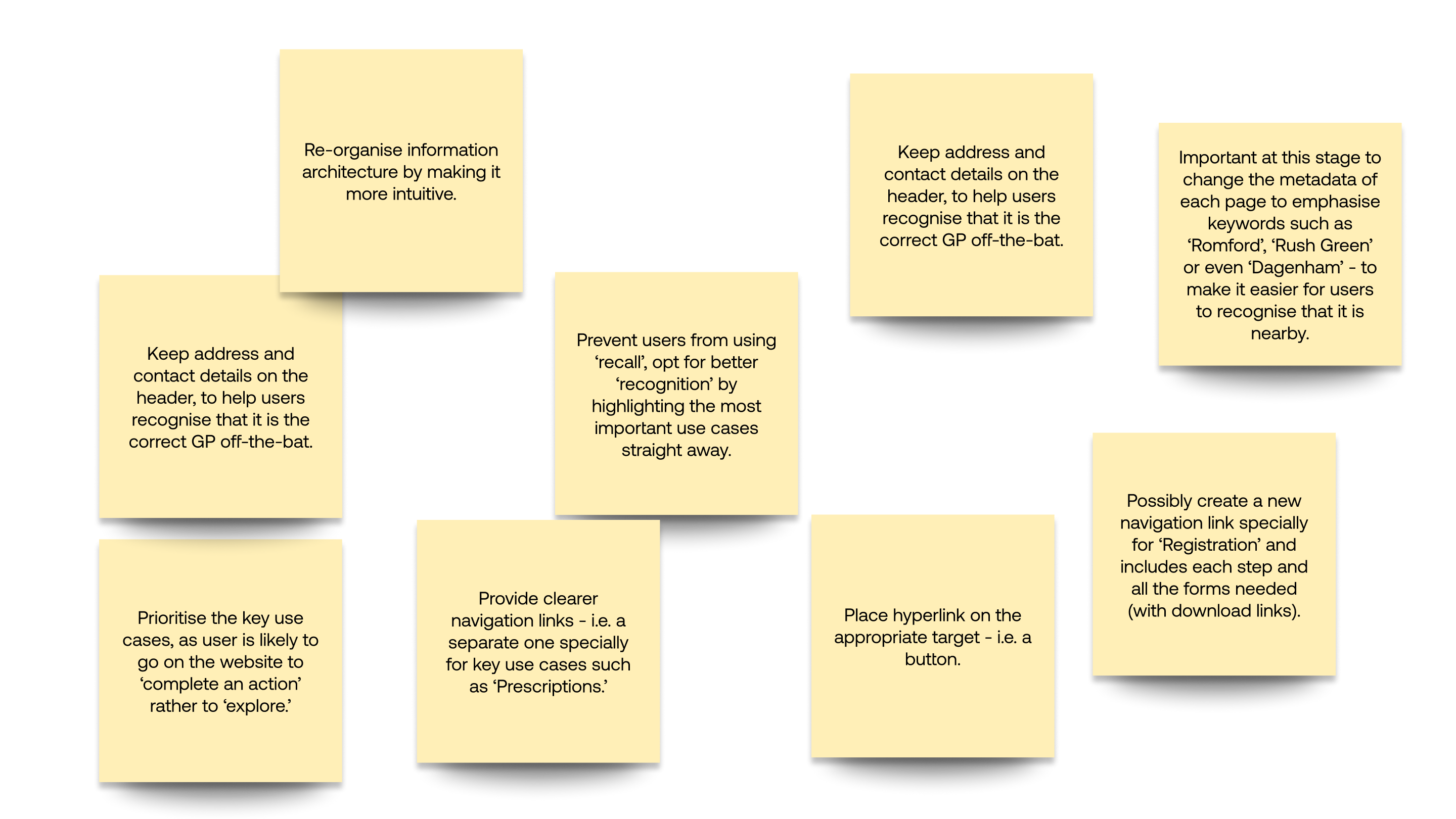
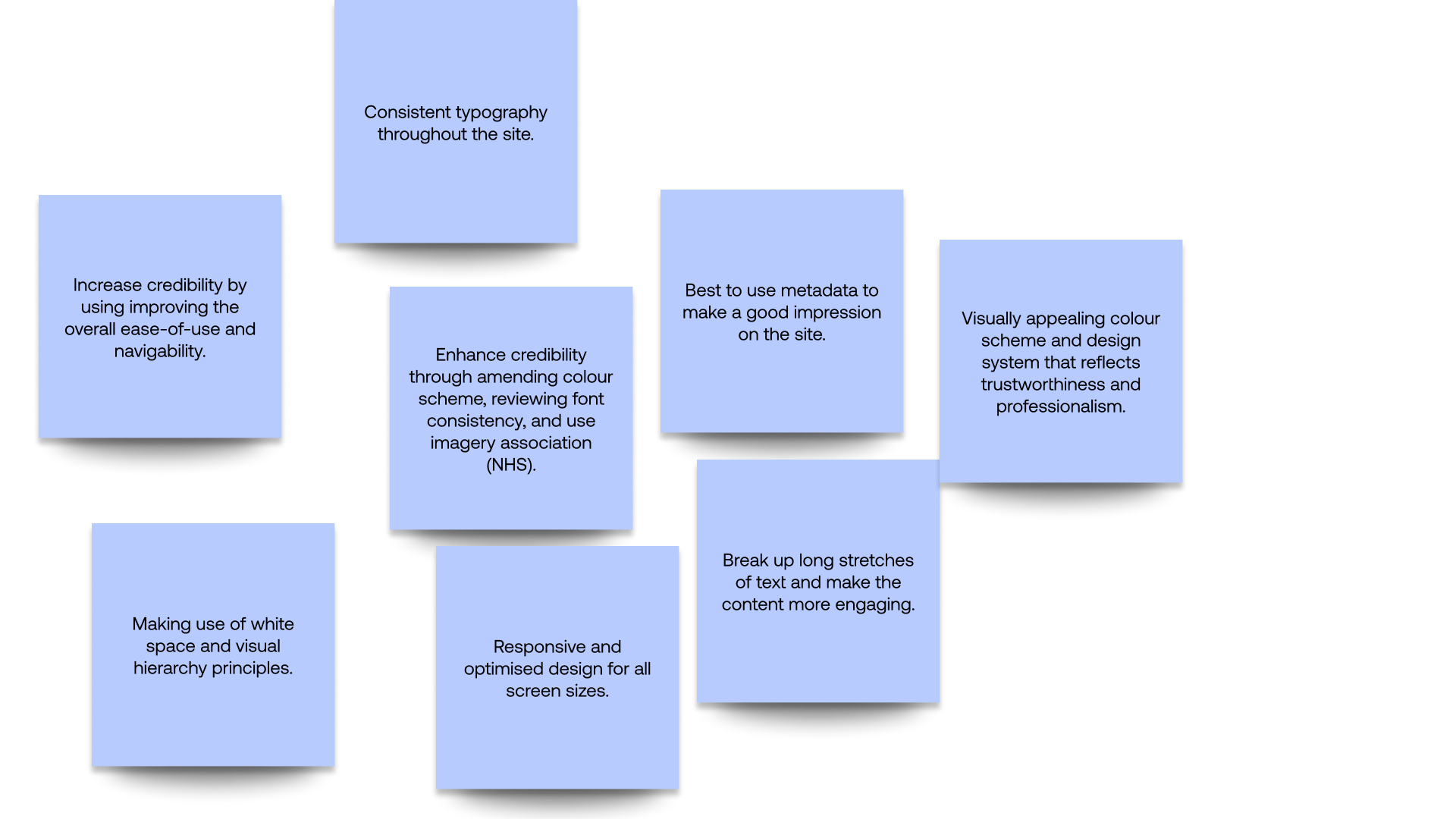
To improve navigation, I need to align the information architecture with users' mental models. This involves reassessing the hierarchy and structure of information to reduce frustration and increase engagement.
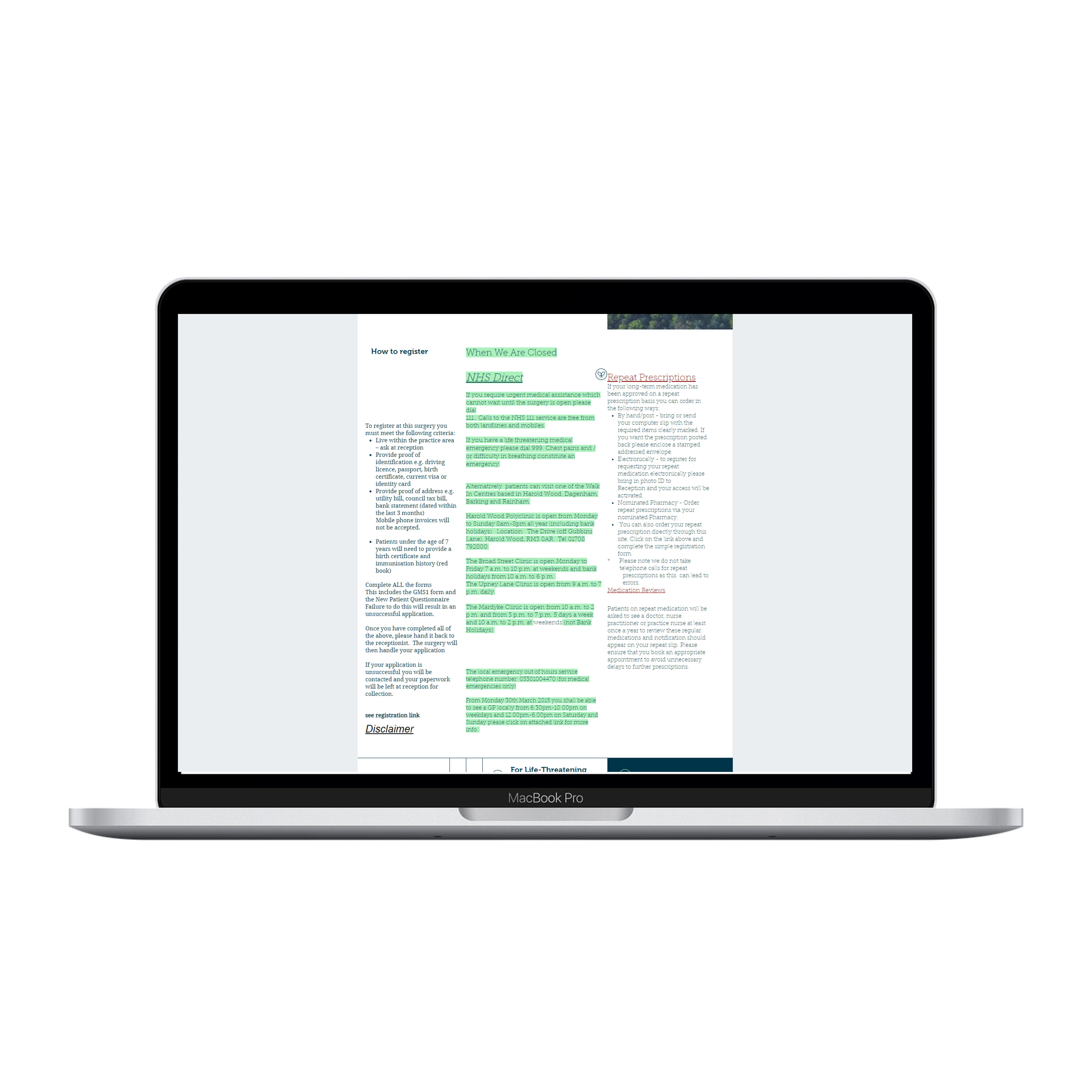
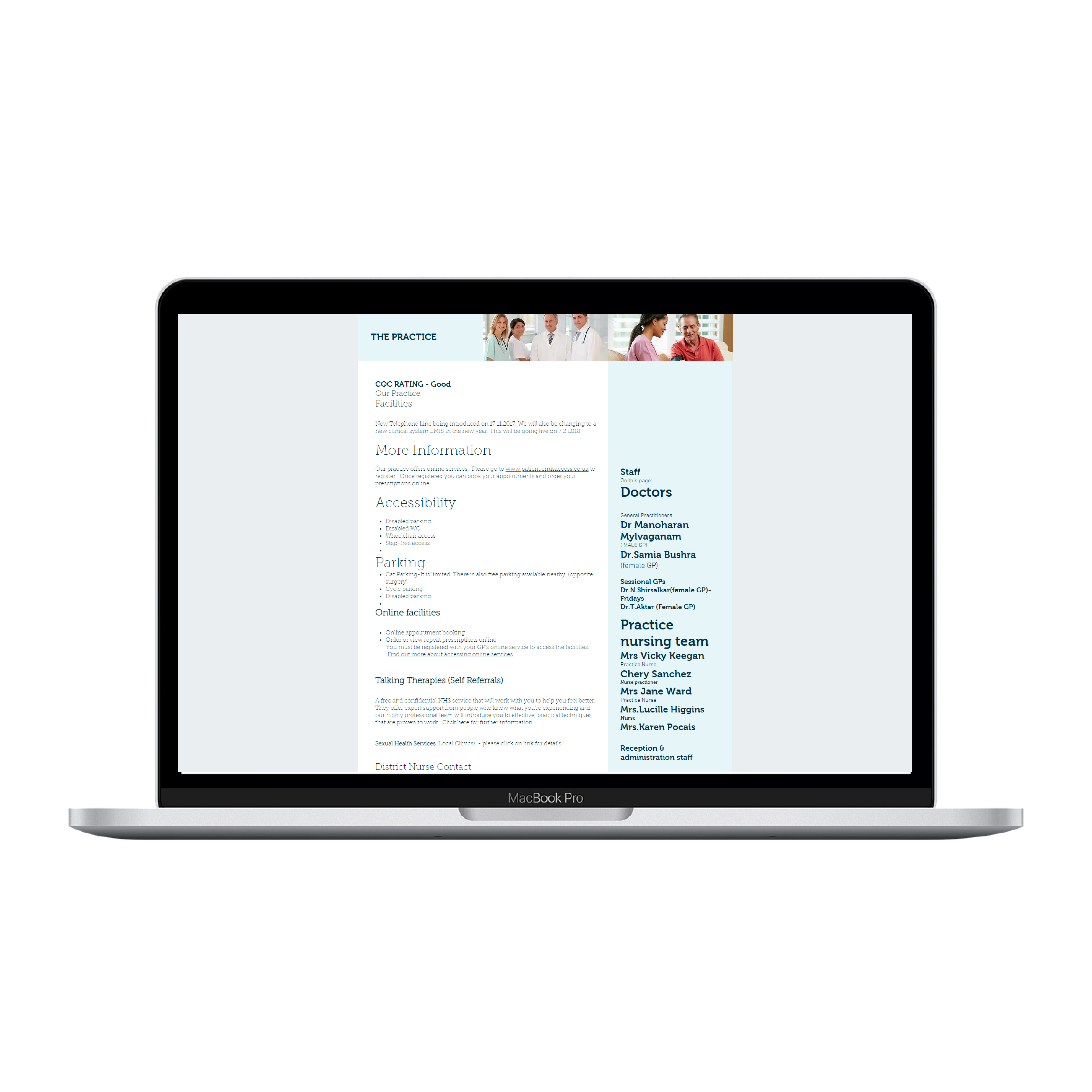
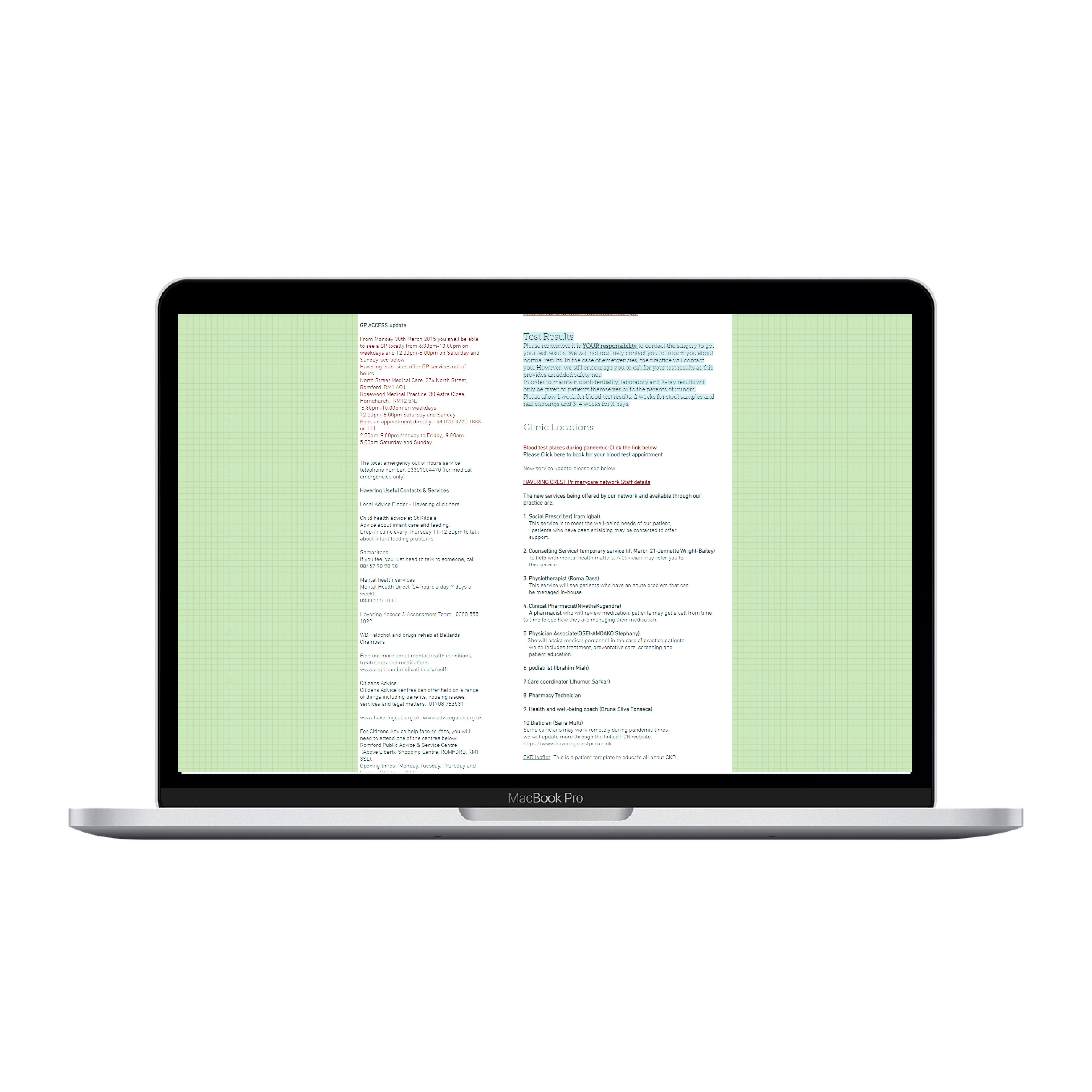
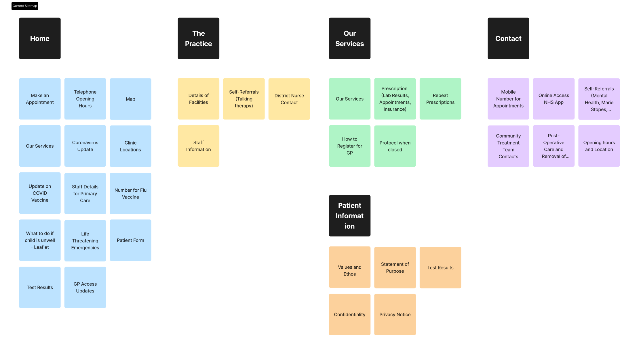
I analysed each page of the website and made a content inventory. It was clear that similar-themed information was dispersed around the site rather than gathered in one place. For instance, Home, The Practice, and Contact all contained information about external teams. This makes it harder for users to find information, because they would need to jump all over the site to find a similar piece of information - i.e. Talking Therapy Self-Help is not found next to other Self-help links (Mental Health) - all in separate pages.
I then grouped similarly-themed items together, to make sense of the information. The most notable is the 'Key Actions' grouping, which display the most common use cases and should be the most straightforward user journey. Next, I categorised 'Internal GP services' and 'External GP services' - as they are both services, there is a possibility in combining them in one page.
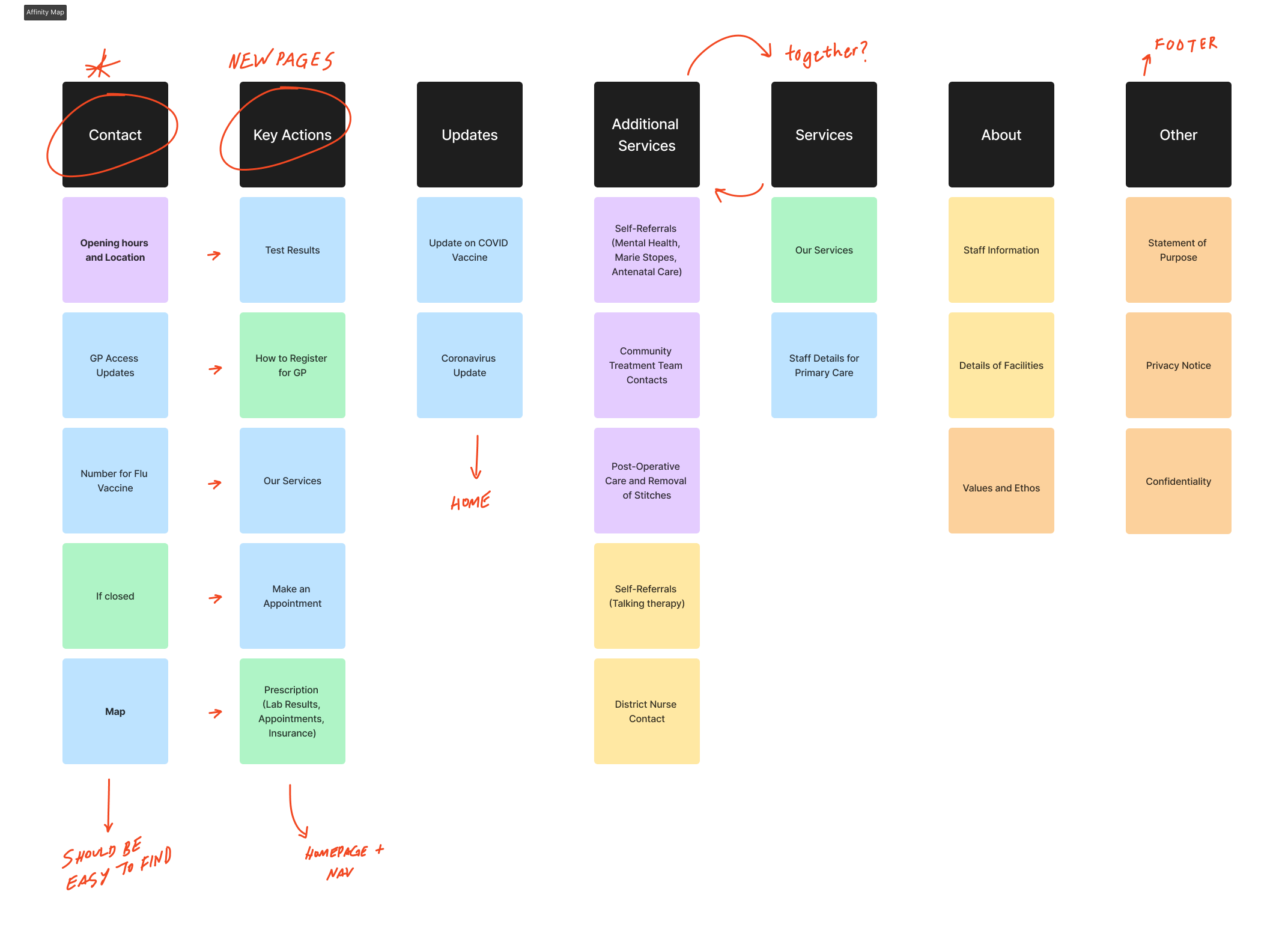
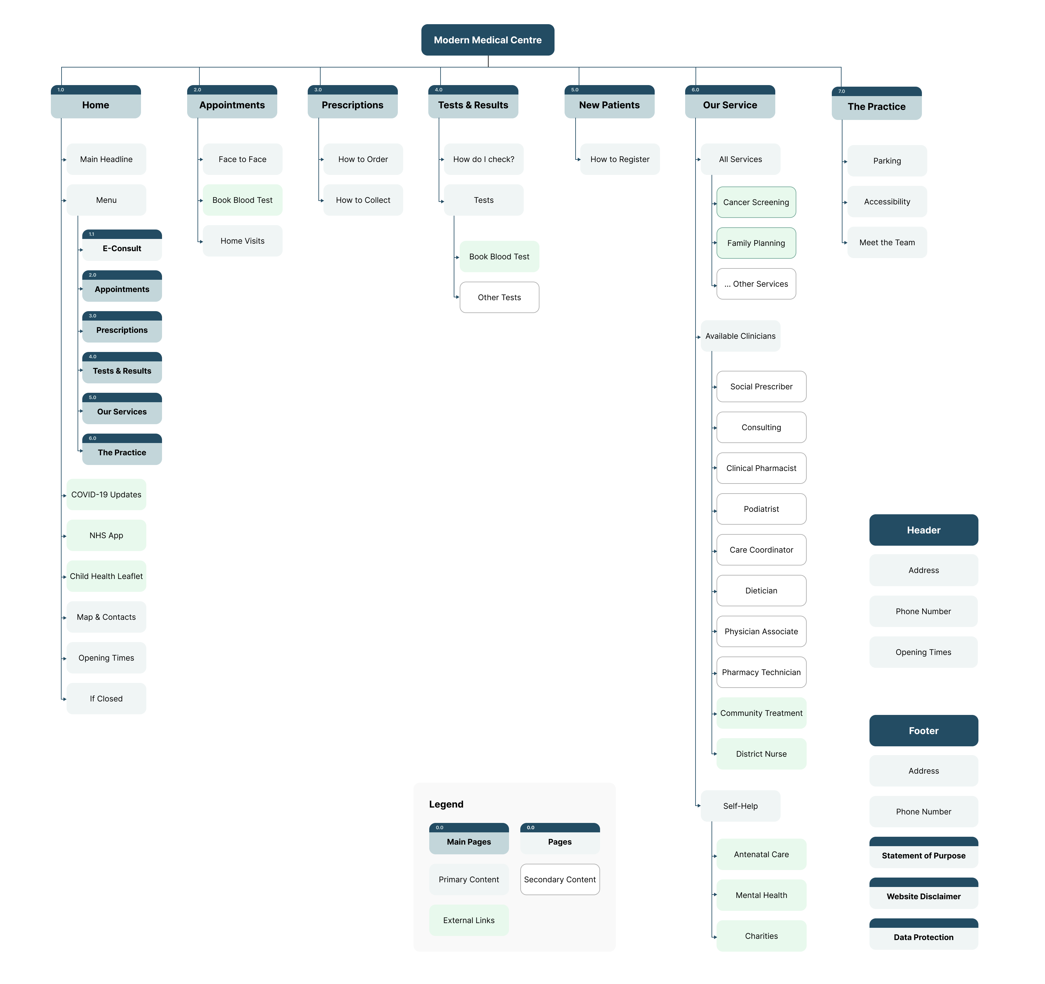
Based on the content inventory and affinity map, I proceeded to create a new sitemap with new pages. The new pages that would be created would be: Test results, Registration, Making an appointment and Prescriptions. Contact will be removed as it will be made obvious on headers and footers.
Due to time constraints, I quickly made several sketches of a potential design of the website using Procreate on the iPad. I made sure to consider multiple design principles such as visual hierarchy, multiple navigation paths and use of call-to-actions - as well as the solutions generated from the 'How might we' exercise prior.
I used Figma to create mid-fidelity wireframes after sketching. Wireframes helped me define the structure, functionality and layout of text and images more precisely. I will show these wireframes to the stakeholders for feedback in the middle of the process to demonstrate how the website will work, and since they are not high-fidelity, I can easily modify them based on the client validation.
I met with the GP staff to get mid-process feedbacks, to ensure that I am going in the right direction, as well as get opinions. I had questions about specific jargon, as well as design decisions that may not be appropriate for their GP referral process. Below is a summary of changes:
1. More emphasis on credibility They mentioned that credibility should be emphasised by adding CQC (Care Quality Commission) ratings to the design, as it adds proof of the credibility and quality of the GP.
2. Removal of Home Visits on Booking Page Home visits were removed as it is not very relevant to patients. Especially as patients require referral from the GP rather than 'Booking' it themselves. This is moved to the Services page.
3. Adding maps on the About Page We agreed on adding the map and contact details on the 'About' page as other users may also want to visit it there.
At this point, the final typefaces, images and font colours were not chosen. But due to the short timeframe, I wanted to test users on the mid-fidelity prototype. This was to help users get an accurate depiction of what the final design might look like, and therefore get a better feel of it. Below, I embedded the Figma prototype.
I also recreated the mid-fidelity prototype using Wix - the web design platform the client requested. It is slightly higher fidelity than the prototype as I started to apply a design system (see below) to standardise buttons, typefaces and fonts. I created this beside the mid-fidelity as I was not sure about the capabilities of the Wix platform. While this is a slightly better fidelity than the previous prototype, it still retained the same navigation structure, layout, and only slight changes to visual elements - therefore, this was also used for user testing.
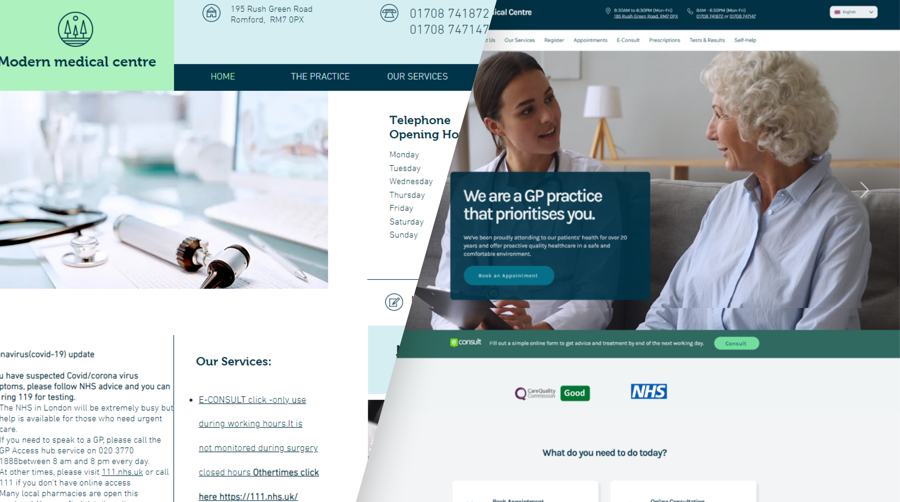
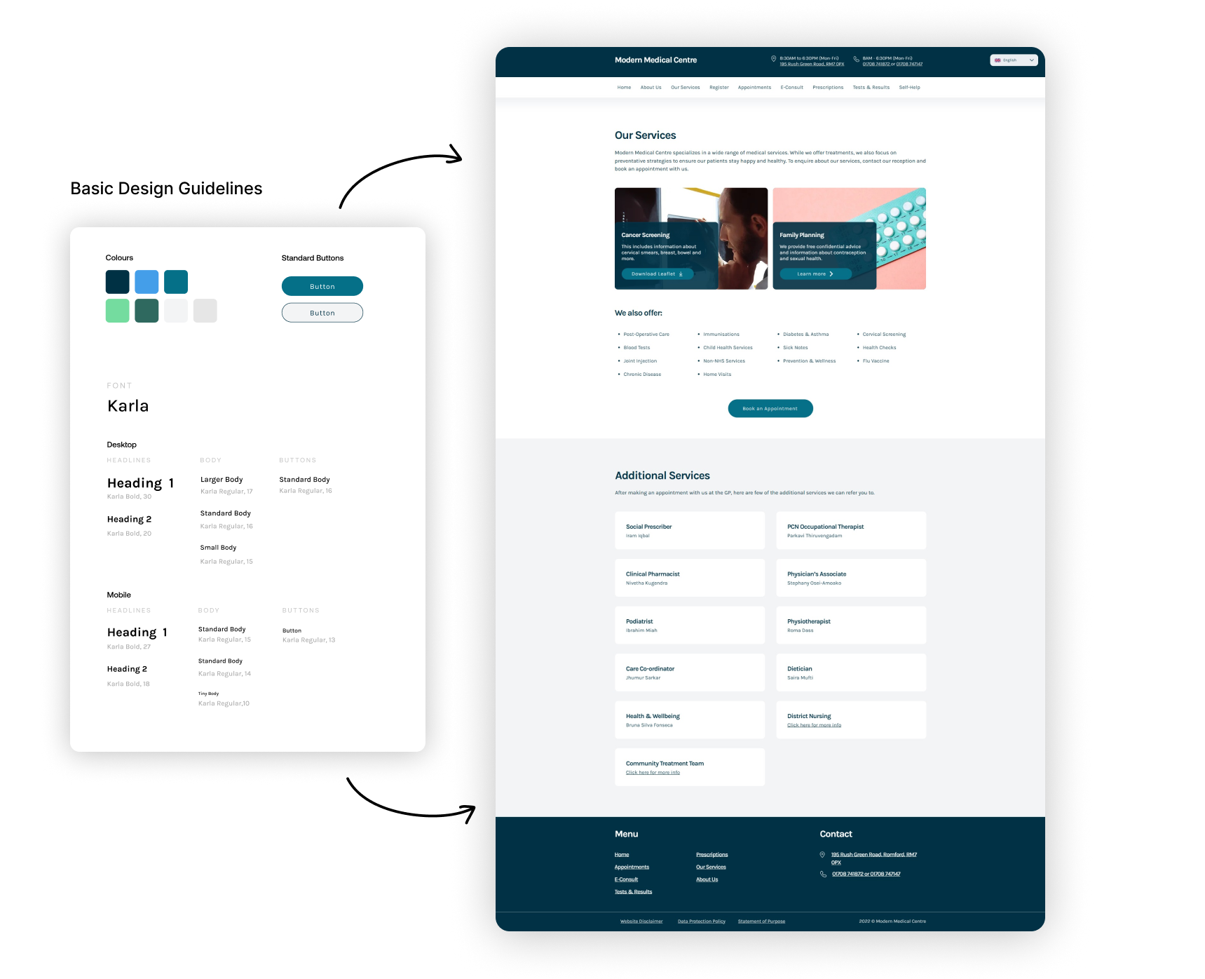
One of the biggest problems with the website was lack of consistency. To address this, I ceated a design guide. Design guides are essential for any website to maintain consistency in its appearance and user experience. A design guide outlines the rules and guidelines for the visual elements of a website, such as colors, fonts, imagery, and layout.
The main colour scheme is blue and green. Blue is associated with trust, dependability, and professionalism, while green is often used to convey growth, harmony, and nature.
Karla is a sans-serif font. Karla has a clean and modern look that is well-suited to the health industry.The font's simple and elegant design makes it easy to read, which is crucial for health-related content. Karla's legibility is particularly important for users who may have visual impairments or other health issues that affect their ability to read text.
Before creating the final design, I wanted to do some final validation testing to see what can be improved with the new-and-improved appearance and informaton architecture. Therefore, I used the same user tasks as the preliminary testing as well as the SUPR-Q questionnaire to see how much the website has improved. So, I gathered six participants from around the ages of 20 to 60 years old, the sample includes one actual patient, two GP receptionists, one nurse, and two designers. They were contacted through a recorded Zoom interview, and some with phonecalls as it was more convenient for them. It took about 20-minutes total for each of them. Two participants was tested using the mid-fidelity prototype and the rest, using the recreated Wix version.
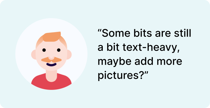
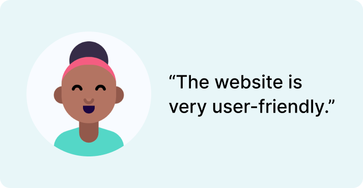
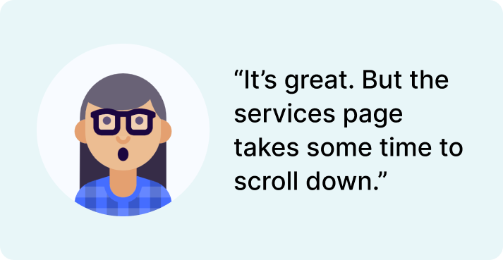
Below are some quotes extracted from the interview. Many of these are positive, but there were a few that suggested that there should be some improvements.
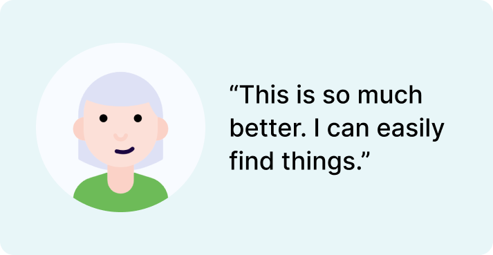
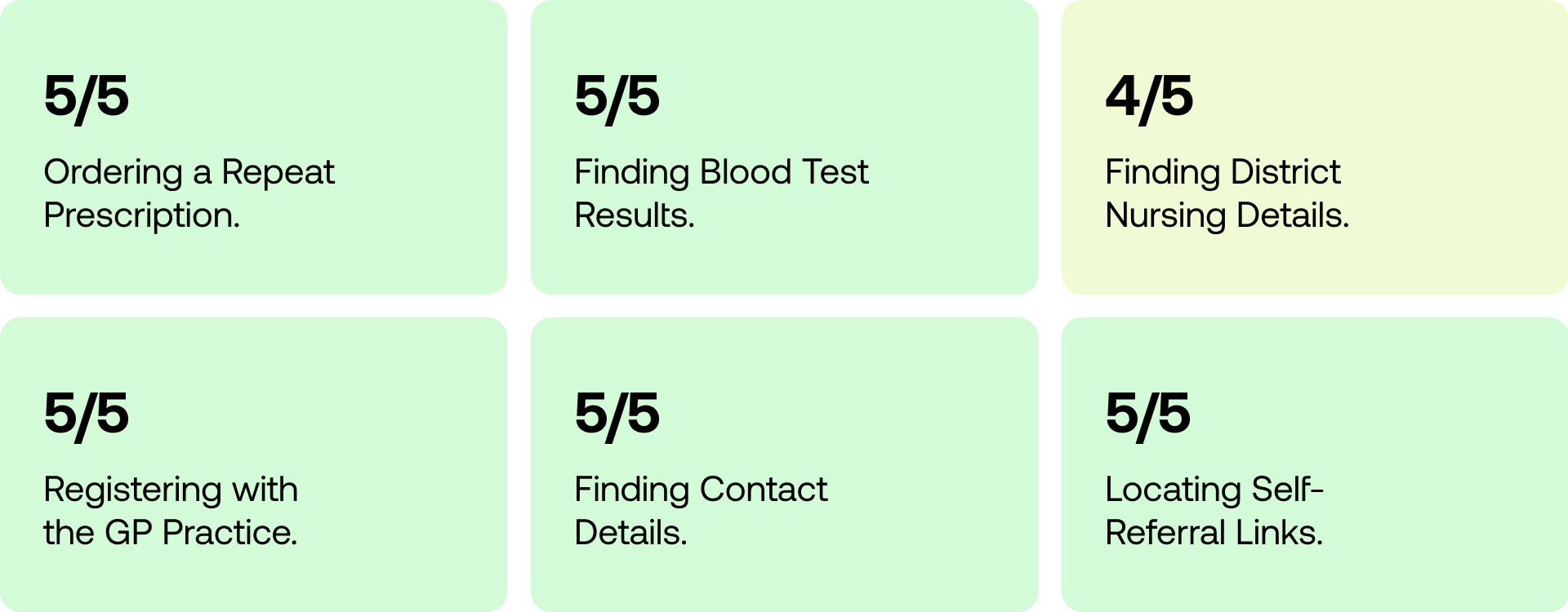
Most of the tasks were completed in comparison to the preliminary test, where the poorest was a 2/5 completion rate. Now, most tasks can be completed 5/5, which is a positive indication that the navigation is much more straightforward.
The SUPR-Q scoring increased significantly compared to the initial surveys on the old website. The highest being in usability, and the lowest credibility - however they all are ranked over 4.5 out 5, and with a total average raw score of 4.8. This indicates that the aesthetics, usability and credibility perceptions are positive. Thus, indicating that the website improved significantly overall.

Usability testing showed that the "Services" page needed improvement, as it required too much scrolling to find the "Self-Help Services" section. To make it easier for users, a new dedicated page for "Self-Help" was added. Also, the E-Consult link was not easily discoverable on the homepage, so it was added to the main navigation menu for improved accessibility.
To improve the user experience, we added pictures to break up the overwhelming text on the Registration page. Research findings showed that users were finding it difficult to navigate and engage with the page due to the long stretches of text. By incorporating visuals, we were able to create a more engaging and user-friendly experience.
Adding opening times, address, and phone number on the header improves accessibility by providing quick access to important information without the need to scroll. Underlining links also increases their visibility and ease of use for all users, resulting in a more user-friendly website design.
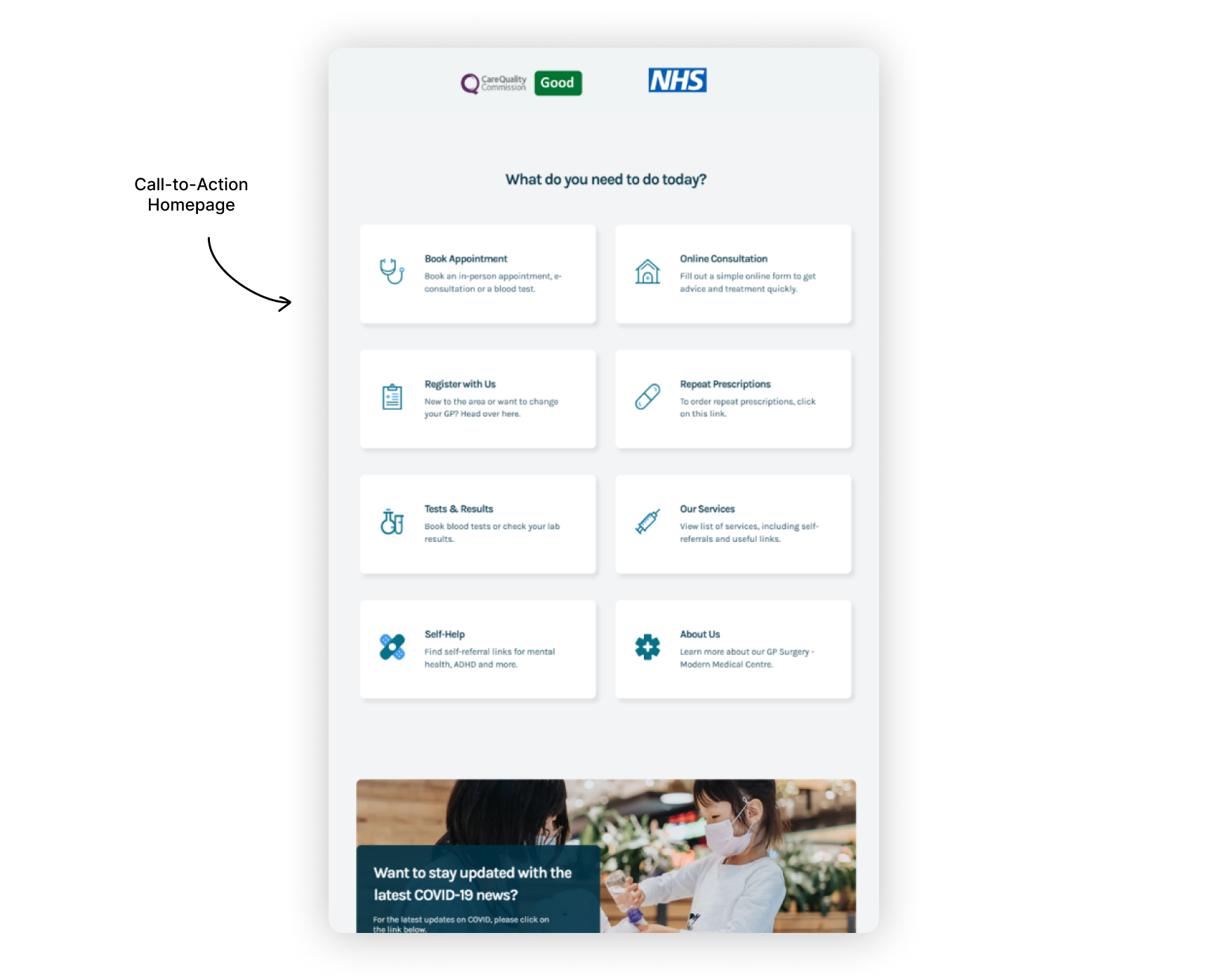
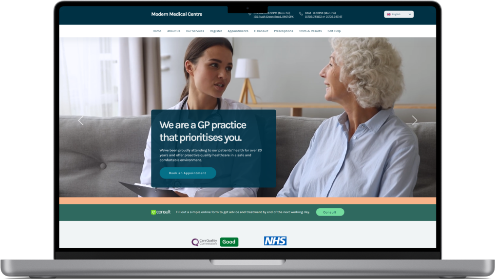
I improved Modern Medical Centre's navigability by adopting an action-oriented homepage. By presenting a clear call-to-action and uncluttered path for users to take action towards specific goals, users can easily find the information they need. This enhances user experience, resulting in increased customer satisfaction and conversion rates. Additionally, the website is able to highlight important services and products and provide a strong call to action.
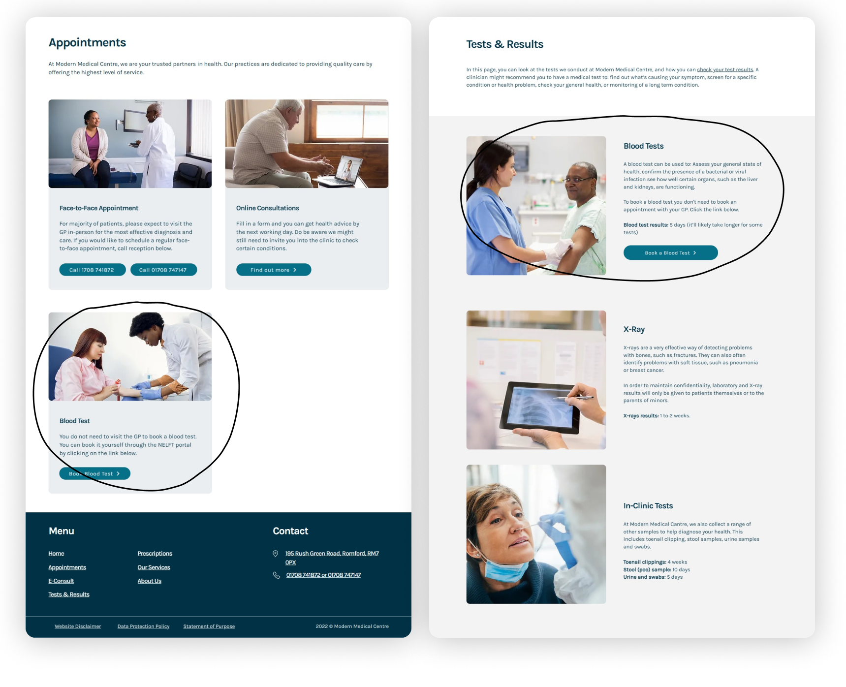
I implemented multiple path navigation to improve the site's navigability (i.e. Can be found by scrolling down the home page and the navigation bar). I provided users with several ways to find information and content that suited their individual preferences and needs. By offering multiple paths, users were able to navigate the site more efficiently, without having to rely on a single navigation structure. This resulted in increased user satisfaction and engagement with the site, as they were able to find what they were looking for more easily. Moreover, implementing multiple path navigation helped to reduce bounce rates and increase the time spent on the site.
By using a consistent color scheme of different shades of blue throughout the website, it creates a sense of professionalism and trustworthiness that is essential for a medical practice. Patients need to feel confident that the information they are receiving is reliable, and a consistent color scheme helps to reinforce this sense of trust. Additionally, using design guidelines can help to ensure that the website is user-friendly and easy to navigate, which is especially important for a medical center where patients may be seeking urgent information.
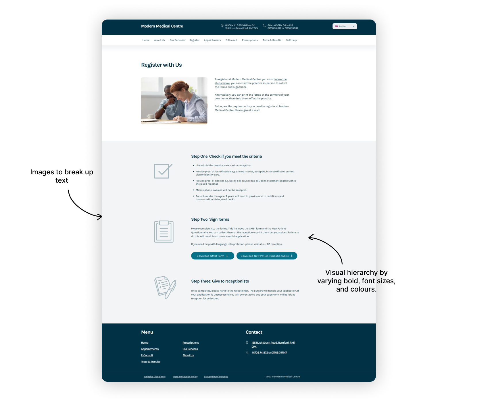
By incorporating a clear visual hierarchy, breaking up text with relevant images, simplifying language, and reducing the amount of text, the website has become easy to read and engaging. And by implementing Miller's Law, the Modern Medical Centre website has made information easier to remember and access by breaking it up into bite-sized chunks, making it more user-friendly for patients. This approach helps users to quickly find the information they need and makes the overall user experience more enjoyable.
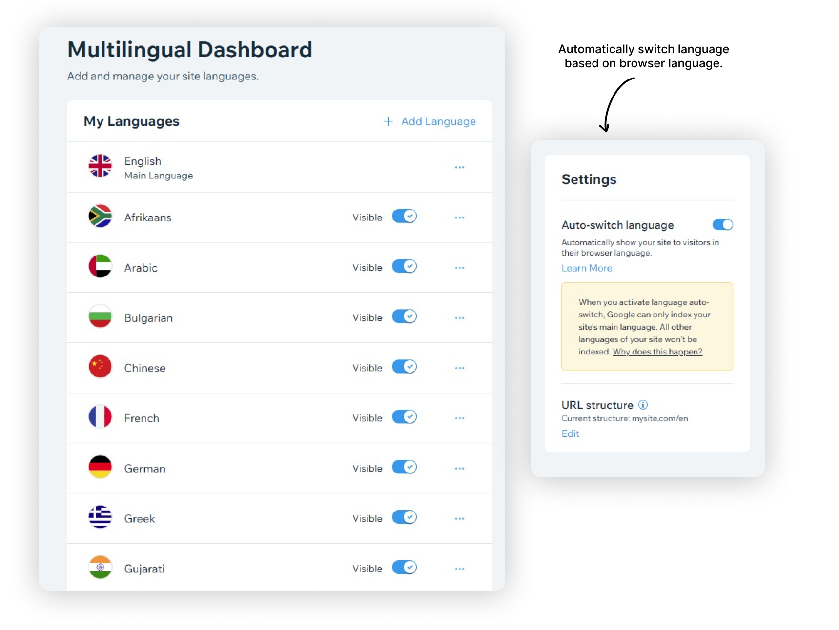
Wix's language features, such as "Auto-switch language," and the ability to add commonly spoken languages in the UK, such as Afrikaans, Chinese, French, and more, are crucial in catering to the diverse demographic of East London. By implementing these features, the website can communicate effectively with a broader audience, making it easier for non-native English speakers to understand and engage with the content. This enhances the user experience and promotes inclusivity, allowing the website to serve as a valuable resource for all members of the community.
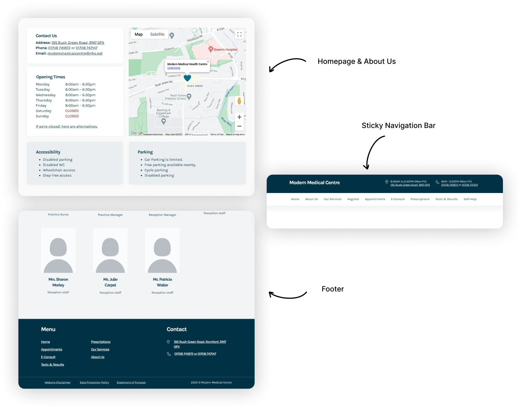
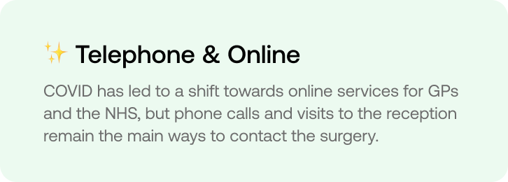
To ensure easy access to the most important information on the Modern Medical Centre website, I have added contact and address details in four different locations on the site. This is particularly important as many users still rely on calling or visiting the surgery, making it imperative to find this information easily. By prominently featuring these details in multiple locations, users can quickly and easily find what they need, resulting in a more efficient and satisfying user experience.
To ensure a user-friendly design, validation must be done as soon-as-possible. Thus, for projects with shorter deadlines, it is critical for prototypes to be created quickly so that they can be tested and validated by multiple stakeholders. During this project, presenting drafts and prototypes were essential in discovering pain points, as well as getting early feedback before committing to more detailed designs.
Completing this volunteer project truly made me realise how fulfilling it is to help others through the problem-solving and design. I loved positively impacting the experience of both local patients and GP staff. This experience has affirmed my love for UX design, and how I want to further grow and pursue this career.
While I created design based on basic accessibility principles such as contrast, size and more. The research could have greatly benefitted from testing with users who have a range of impairments, such as visual or mobility. By testing with impaired users, it can help provide better insight on how I could further make the website accessible.