.png)
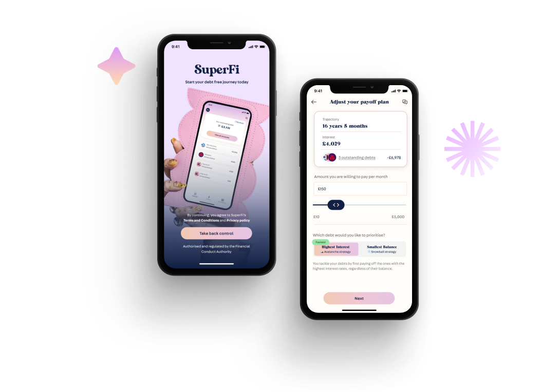
In the UK, soaring living expenses and limited financial literacy worsen many's economic situation. SuperFi seeks to create an easy-to-use app that helps pay off debts for those struggling with finances.
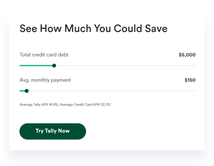
SuperFi presents the avalanche and snowball techniques, which are industry-standard debt repayment methods. To assist debtors in repaying their debts, the app aims to make this accessible to everyone. But given that just 38% of UK adults felt confident about managing their finances in 2020, it's likely that most people need to be made aware of what these strategies entail (FCA, 2020).
Making a user-friendly debt strategy selection flow is the aim. This feature will simplify and break down financial complexity so that consumers can easily select the payment plan that best suits them.
I improved the debt payoff strategy flow by investigating user needs, keeping up with market trends, and improving design and features through wireframing, prototyping, and teamwork. This has been accomplished by making financial concepts easier to understand for users.
I examined the Debt Payoff Planner and conducted a comprehensive task flow audit. The goal was to investigate the product's appeal and determine how SuperFi could set itself apart. This required making observations, performing an audit, and downloading the apps. We aim for SuperFi to rise above user expectations by considering the insights gained from these top applications. A few screenshots from the task flow audit are shown below.
Debt payoff apps provide side-by-side strategy comparisons, showcasing outcomes and aiding decision-making for users, even if they're unfamiliar with terms like "avalanche" or "snowball."
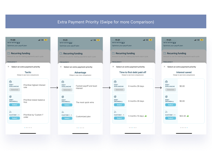
Many popular payoff apps utilise graphical representations. Visualising data through graphs enhances user understanding of available options and their impact on outcomes, facilitating quicker decision-making with visual feedback.
Found that platforms vary in input methods, with some featuring manual entry and others utilising sliders. Interactive sliders, especially for variables like interest rates, enhance the ease of comparing payoff times, allowing users to swiftly assess different scenarios.
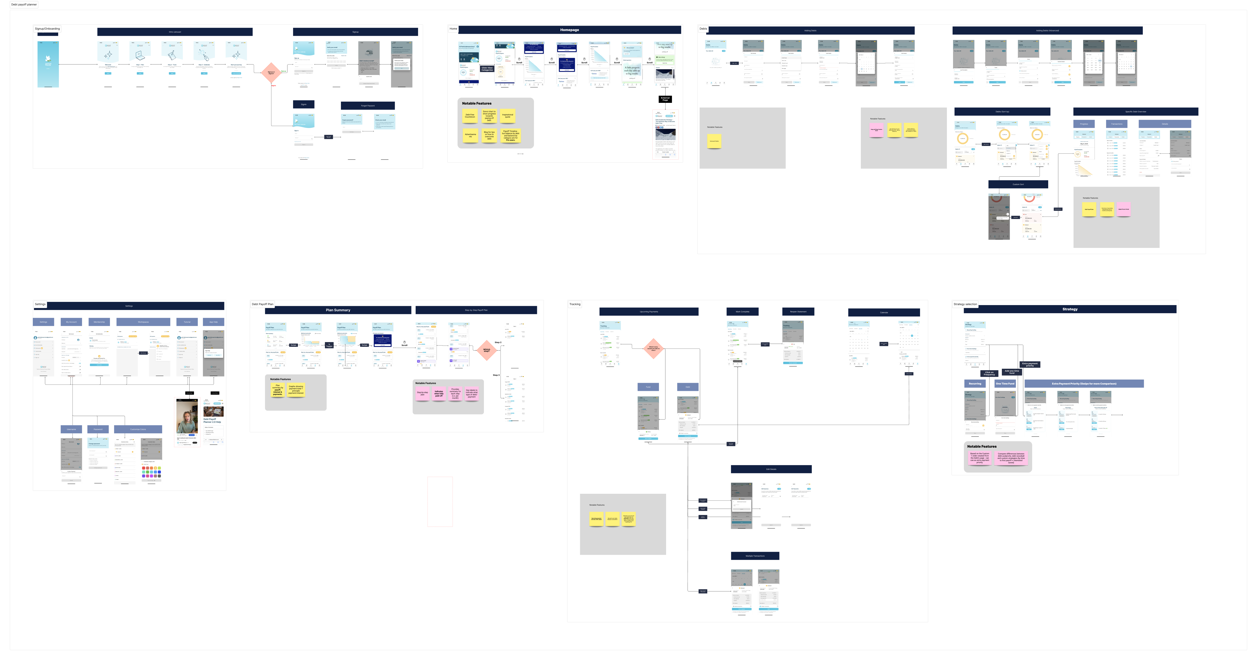
I first examined the competitor's offering before selecting a debt strategy by analysing the current flow. This was done in an effort to identify the process's advantages and possible areas for improvement. The following are the key conclusions from this analysis:
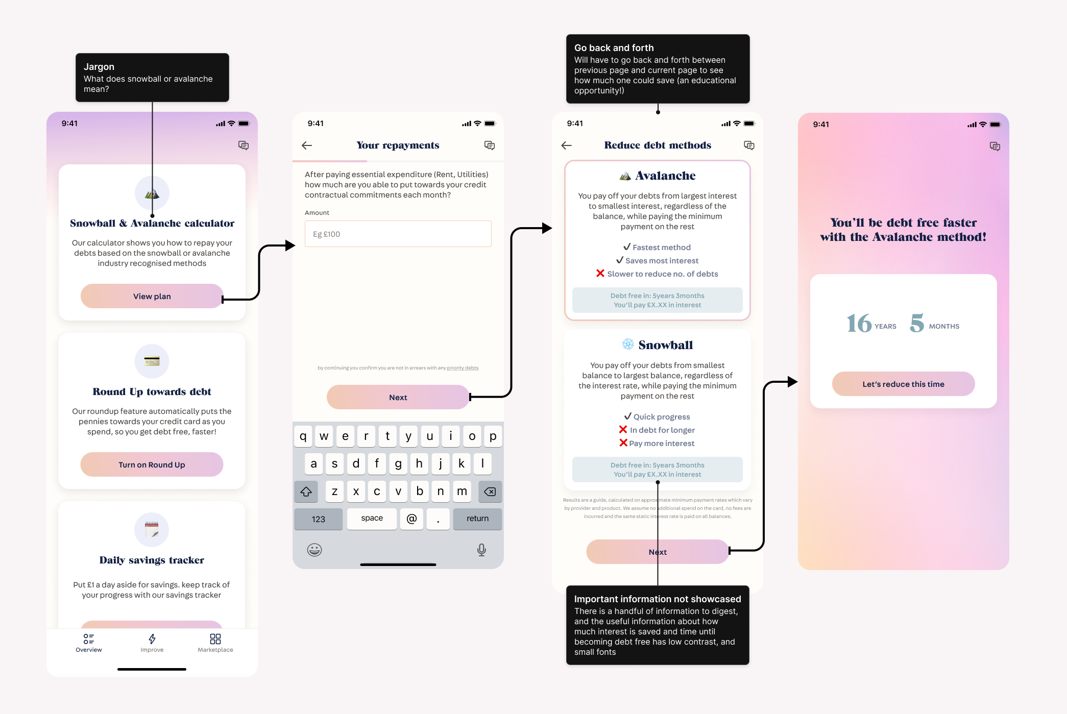
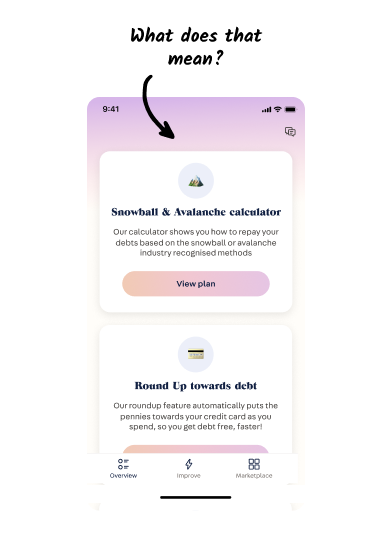
Missing an opportunity to educate the users (Making informed decisions!). The flow is quite simple. However, through analysing main competitors in the space, they offer better educational opportunities when comparing debt strategies.
Important information not showcased. There is a small, low-contrast indicator of time and interest savings however this data is not highlighted.
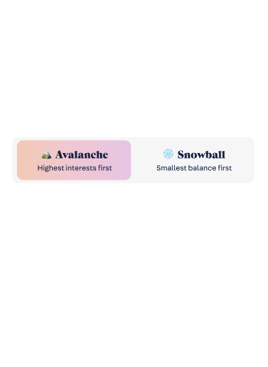
Some words appear to be jargon. Terms such as "Snowball" and "Avalanche" are likely to be unrecognised by the mass population.
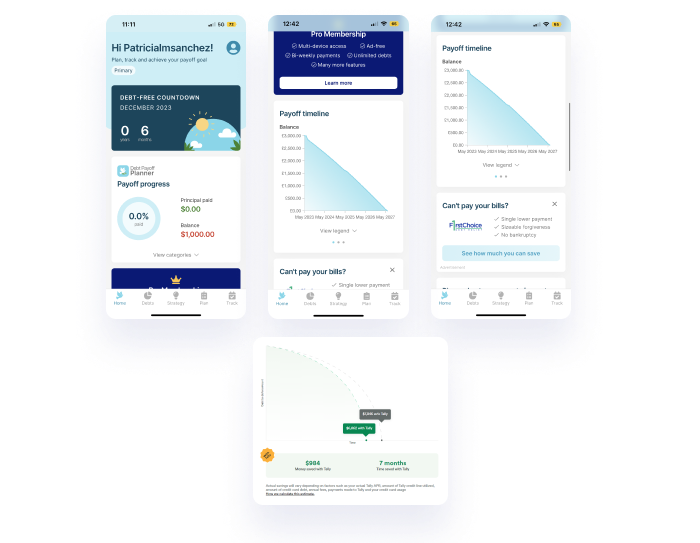
Following the audit, our team gained a deeper understanding of the Debt Payoff Planner application's intricacies and design. This exercise has been instrumental in identifying areas for improvement and drawing inspiration from exemplary UX/UI practices in the finance field.
Graphical representation helps understanding. It is important for the application to enable users to seamlessly adjust their debt repayment plans and timelines so that it remains accurate and realistic to their situation.
Sliders will make it easier for users to see potential savings. The competitor app had many different features that enabled users to easily compare, and adjust their application.
Optimising copy to help make it easier-to-read. It is important for the application to enable users to seamlessly adjust their debt repayment plans and timelines so that it remains accurate and realistic to their situation.
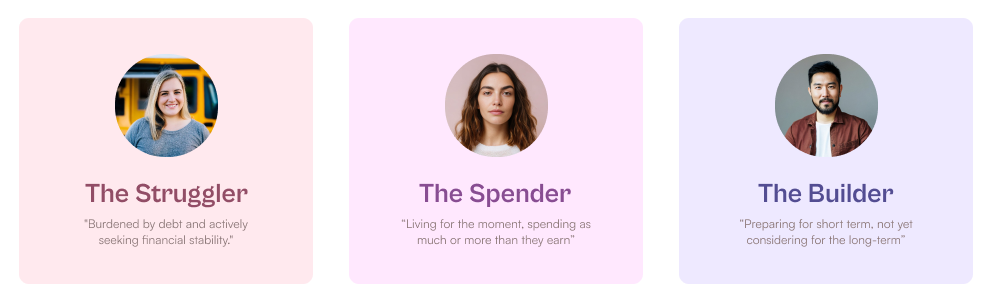
Superfi recognises that people vary on spending habits, financial attitudes and financial literacy. Therefore, as a strategy, It's crucial to find a balance: keeping things simple for those new to financial strategies while offering complexity for users who want more control over their finances. Here are the main user groups:
Spenders: This group tends to lack long-term financial planning and engagement with their finances, often viewing banking as a mundane task.
Strugglers: The second persona includes individuals who constantly struggle to balance their finances. Quotes "Finance is boring!"
Builders: Superfi also caters to customers who seek greater control over their financial situation, providing them with tools and resources to take charge of their financial destiny.
The best way forward is to consider users who are not well-versed in finance. Thus, wording should be inclusive, but also enable users to make better decisions and take better actions. The main persona we should be focusing on is the strugglers, those who need help. By making application universal, it benefits all. Universal design can expand the potential user base and reach a larger audience.
In pursuit of optimal solutions for the given problem statement, I crafted mid-fidelity designs and engaged in collaborative brainstorming sessions with experienced colleagues in the financial sector. Through these discussions and explorations, my initial ideas were refined and allowed to evolve. This approach not only facilitated the exploration of various concepts but also ensured that the designs were well-informed and aligned with industry expertise. Below are some of the explorations:
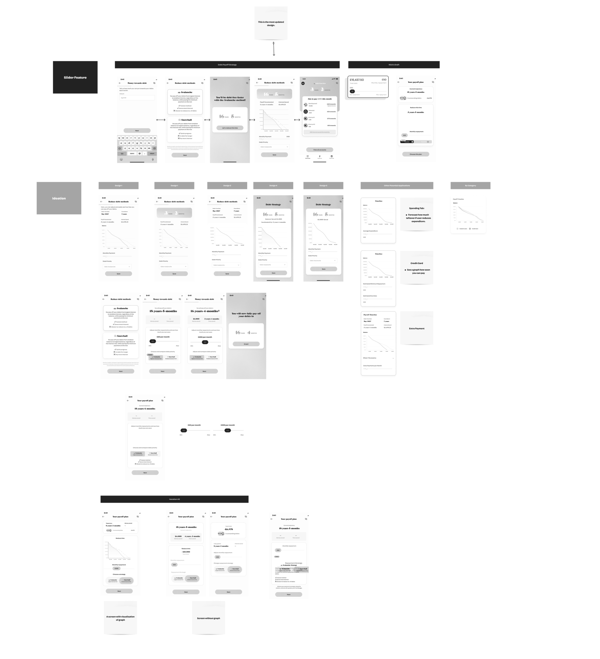
Sliders enable users to personalise their payoff plan by providing a visual representation of the process. This tool makes it easier to quickly explore a wide range of possibilities with immediate feedback , thus, helping them make an informed decision.
Reference: Smashing Magazine
Considering the implementation of before-and-after visualisations, such as graphs, aims to empower users to compare different payoff strategies easily, enhancing visual clarity and understanding. A notable challenge involves determining the optimal font size for elements on the page, particularly the graph.
Reference: UXMatters
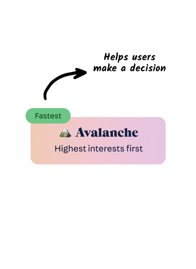
In the process of organising the page, I considered different approaches to maintain clarity of essential information without overcrowding. The decision-making involved determining whether to present information step by step or all at once. The solution centres on highlighting the most crucial information for users, with a focus on key elements like duration and money saved to effectively capture their attention.
Reference: Designing with the Mind in Mind
Tabs provide instant visibility for debt payment changes, allowing users to compare strategies. They enable interactive exploration of scenarios by adjusting interest rates, amounts, and terms, aiding decision-making based on financial priorities.
Reference: Smashing Magazine UXMovement
By breaking down jargon and presenting information clearly, the app empowers users to navigate their financial journey effectively. It becomes a valuable tool for enhancing financial literacy, as users can make informed decisions and also be able to confidently navigate the app without confusion. Especially as concepts like "snowball" and "avalanche" strategies are likely to be unknown to many. An important part of UX writing for banks and fintech is to work on explaining the features and clarifying the flows from the users’ point of view.
Research carried out by Nielsen Norman Group shows that people read (or scan, rather) 25% slower online. Complex language will slow down the user experience even further.
Advice can offer tips and recommendations for optimising their debt repayment plans, which can lead to more efficient and effective strategies. Ultimately, incorporating advice into debt payoff strategy comparisons empowers users to take control of their financial journey and make the most informed decisions possible.
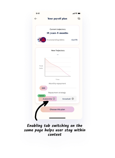
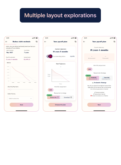
To enable users to easily compare against different strategies, I explored the option of enabling users to switch via tabs. This will adjust the strategy, and simultaneously adjust the debt payoff time, and include how much money the user would save. Next decision was to decide whether it is best to incorporate multiple pages for the flow, or try to condense information into one page. The pro to having multiple pages is to help relieve cognitive load, and enable users to focus on information one-at-a-time. On the other hand, having information all in one page enables users to contextualise all information in one page.
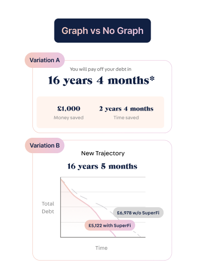
Another consideration was to remove the graph. While at the beginning, I thought graph visualisation may be useful in helping users to understand debt payoff strategies, I started to think that it might be redundant.
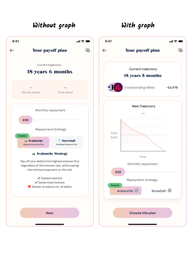
After iterating the design multiple times (at least three times), I created a new proposed task flow to the existing design. I created two designs to test.
Nearing the end of my 2-week internship, I sought to test these new concepts with 2 participants via the testing platform Tandem. The objective was to (I) Evaluate usability and user experience of the debt payoff slider app screen, and (II) Measure task completion time, error rates, user satisfaction & ease-of-use. I intentionally screened for participants who have debts and are actively seeking to pay them off.
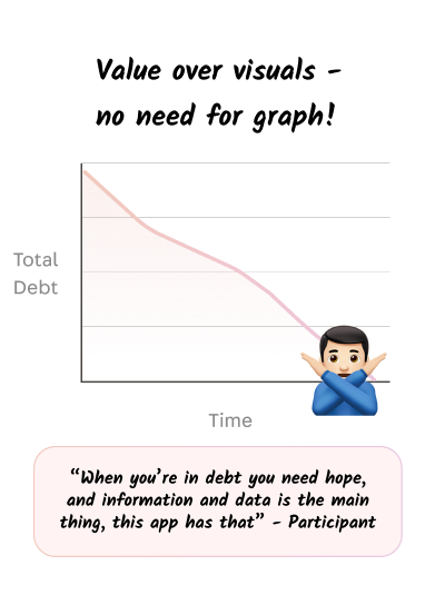
Participants felt that the graph was unnecessary as plain numbers represented values more efficiently.
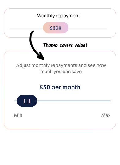
User's pointed out that their thumb would cover the value making it difficult to view and adjust monthly repayments. Therefore, adjusting the design to clearly display value is a priority.
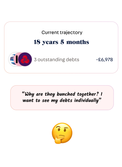
Wants to be able to see all debts, and not have them grouped together. So as a solution, there is a potential solution of enabling users to turn it into a clickable link to show a breakdown of the users debts.
Participants didn’t understand what snowball or avalanche wording meant, they suggested this feature could be called ‘Debt management calculator’ as that summarises the purpose of the feature.
After gathering findings from the moderated user test, I proceeded to make changes to the design according to the results. Changes include removing the graph, clearer copy, improving the slider and considering functional elements such as slider intervals. This new iteration was presented to the team to finalise my 2-week internship.
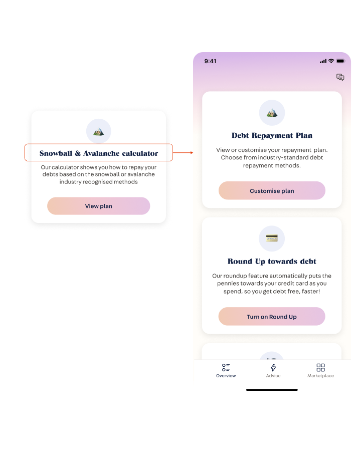
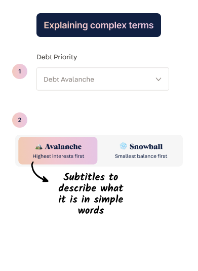
Problem: Findings showed that marketplace wording was unclear due to jargon. "Snowball" and "avalanche" are unfamiliar terms to most everyday people, and therefore non inclusive. While jargon is meaningful to insiders, it doesn’t usually make sense to anyone outside of the group. Therefore, it is ideal to use plain language instead.
Solution: As a result, I renamed it from "Snowball and avalanche calculator" to "Debt repayment Plan." A term suggested by the participants. In addition, a simple explanation was included to help manage expectations prior to clicking on the "customise plan" option - which better conveys the purpose of this option.
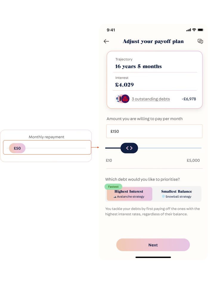
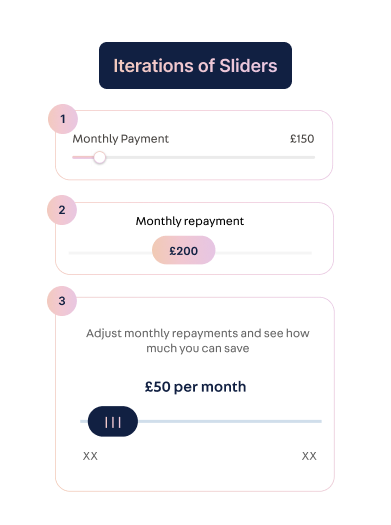
Problem: According to findings, the thumb would cover the value of the number, and therefore, makes it difficult for the user to adjust numeric value as it is omitted from their view.
Solution: Therefore, as a solution, I redesigned the slider by displaying the numeric value above it. So, as the user adjusts the slider by dragging it with their finger, the number above dynamically adjusts. Furthermore, I included a double chevron icon to visually indicate that it needs to be dragged horizontally; and a slider track to provide visual feedback how much has been selected of the slider.
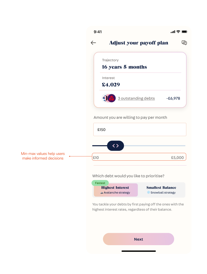
Problem: A missed consideration are slider intervals - it should be granular enough to provide specific values, but also broad enough to enable exploration. A slider is helpful because it allows users to explore a wide range of options quickly - and thus helping them to make an informed decision.
Solution: I've added clear min and max numeric values to each end of the slider to help users understand their adjustment range precisely. The default maximum is set at a reasonable 5,000 GBP. Considering the bank account connection, there's potential to use financial information to determine a more suitable maximum repayment value. I've set the integer interval to 10 GBP, as monthly repayments below this amount are uncommon.
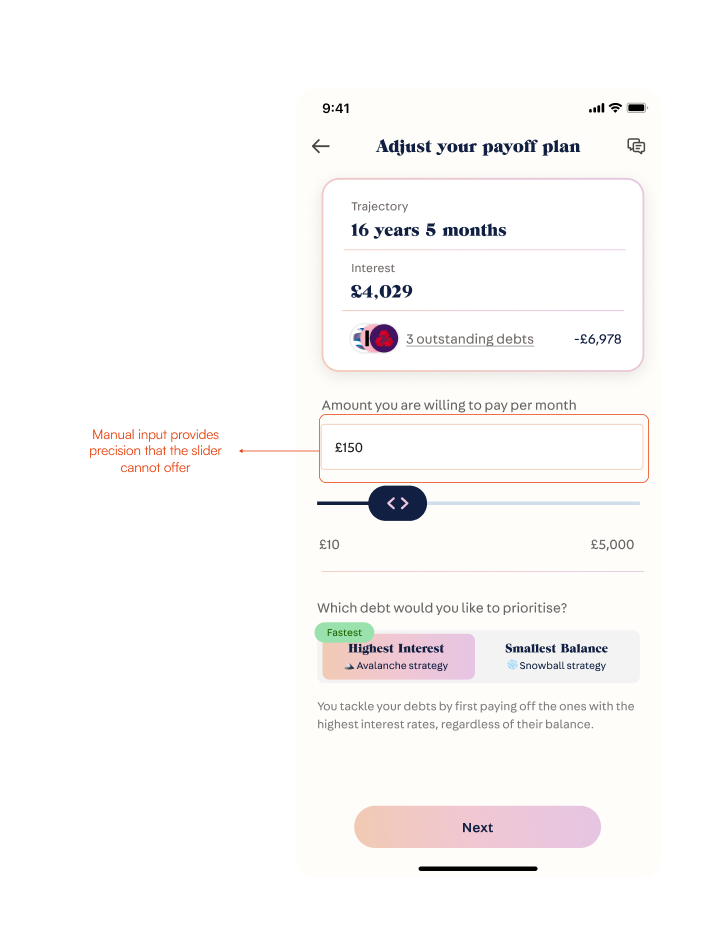
Problem: The drawback of using a slider includes lack of granular amounts. While some users may want to explore different repayment amounts, there are users who may already have a number in mind that they would like to enter directly.
Solution: A slider may take too long, so it is important to provide users the ability to enter their desired amount. Thus, I included an input field above the slider. Once entered, the slider should also dynamically adjust.
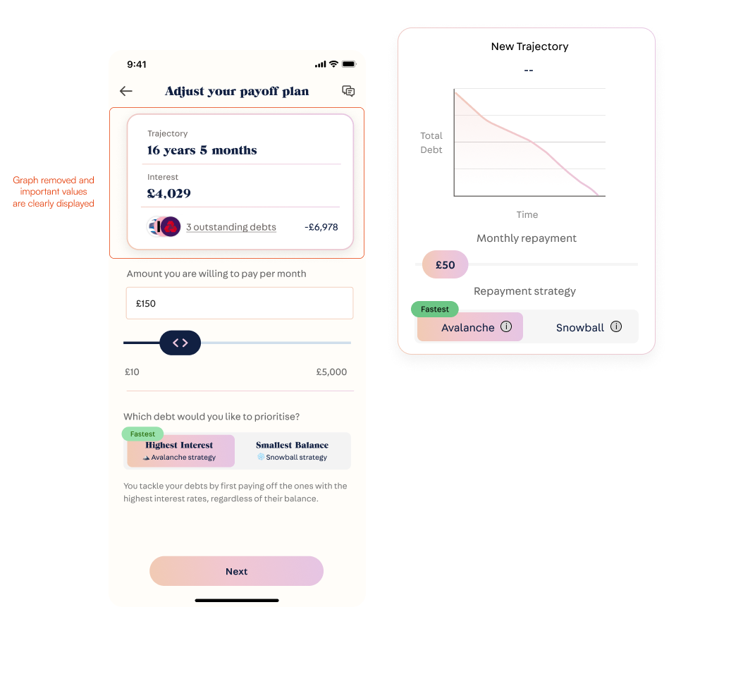
Problem: Participants viewed the graph as unnecessary, as numerical values effectively conveyed the adjusted trajectory and interest.
Solution: Therefore, in order to save space and avoid redundancy, I re-prioritised and placed value over the visuals.
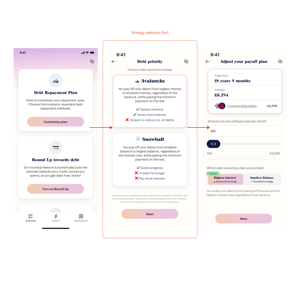
Problem: Findings show that participants remain confused about the strategies due to having difficulties in understanding the concepts.
Solution: To simplify the process, we're using progressive disclosure by keeping the strategy selection page before adjustment. This method gradually reveals elements to avoid overwhelming the user. On the repayment calculator page, users can easily switch strategies, allowing them to compare trajectories and interest rates without constant page navigation.
Despite the short duration of my internship, I proposed valuable iterations and enhancements to certain aspects of the project. While I may not have full visibility into the project's current status post-internship, I am proud of the positive impact I was able to make during my time. By actively participating in discussions and proposing iterations, I believe I have contributed ideas that could further enhance the project's success. I am grateful for the experience and the opportunity to be part of a team working on such an impactful initiative.
Developing a range of concepts and gathering feedback from the design team has helped in pinpointing the most optimal design solutions. This iterative approach allows for the exploration and refinement of diverse ideas, leading to an optimal, user-centric design.
Only until the end, I realised when users interacted with the sliders that I needed to consider the fine interaction regarding minimum and maximum values - as well as consider the intervals. Therefore it is important to do research.
Simplicity stands as a core principle in design. While creating multiple designs featuring graphs, extra labels, and more, the evaluation process, including critiques and user testing, revealed that streamlining flows and UIs reduces cognitive load and enhances intuitive user experiences. Consequently, I refined the design, opting for a cleaner, more intuitive approach in line with the principle of simplicity
If I had been given additional time, conducting tests with a larger pool of users would paint a better picture into the pain points and preferences of our target users. This, in turn, would contribute to a more robust and universally effective design.