.png)
I conducted 4 interviews with houseplant domain experts who considered themselves as plant collectors. My interviewees consist of working adults between the ages of 28-50 years old, half of which started collecting during the start of the pandemic, while the others have been caring for plants for multiple years. Interviewing experts provide a more in-depth look into the relationships between certain topics about plants, and how might we organise the site information.

The competitor app had many different features that enabled users to easily compare, and adjust their application.

Much of the experts credited their knowledge to their own self-learning through online searches and youtube videos. This suggests that content consumption is essential to becoming a seasoned plant-carer.

After conducting the interviews, I realised the depth of the subject, particularly scientific names, and botanical knowledge. Thus, I narrowed the scope to beginners. I realised that the terminologies for labelling will be strongly determined by the level of knowledge the user has.
Plants have specific needs such as watering, sunlight, and placement. Different plants have different requirements, some needing more frequent watering and direct sunlight, while others can go longer without water and prefer indirect light. Experts intentionally place plants in different areas of the home based on these needs.
Experts emphasized the importance of diagnosing and solving plant problems, such as root rot, insects, and cold weather. As a result, new plant owners should not only learn how to choose and care for their plants but also be equipped to address issues that may arise.

Experts recommended various tools for indoor plant care such as cutters, scoopers, gloves, drainage systems, fertilisers, and artificial lights. Some even make their own tools by repurposing boxes or furniture.
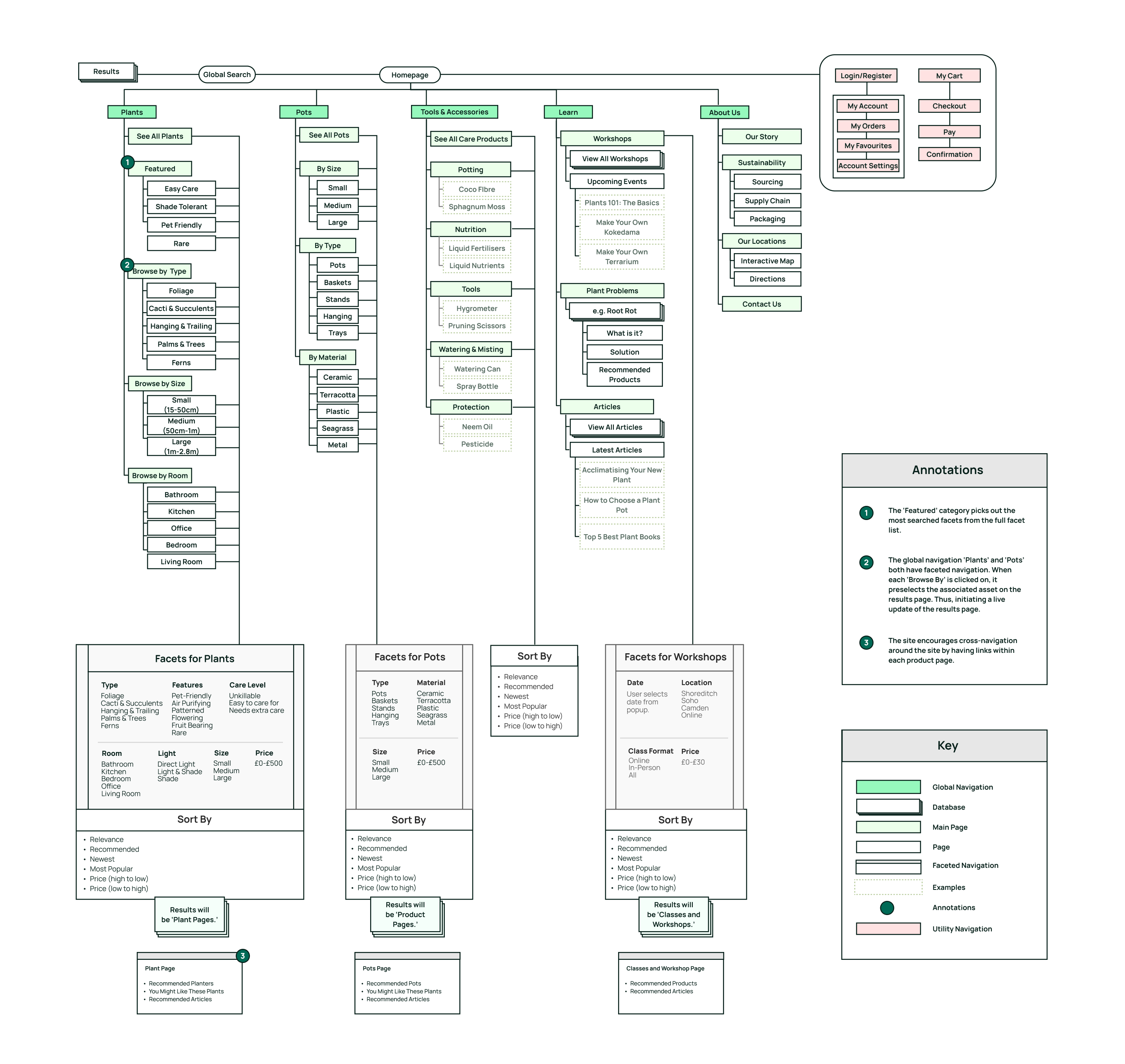
A domain map for indoor plants is a visual representation of the different aspects of the subject. Research and expert interviews showed that the topic is vast, covering types of plants, problems, care, and buyer traits. The map prioritized key entities and used color and size to distinguish them. Important entities included buyers and types and features for purchase decisions and categorization.
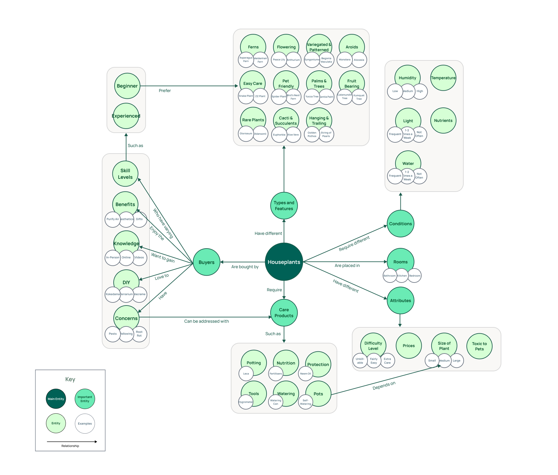
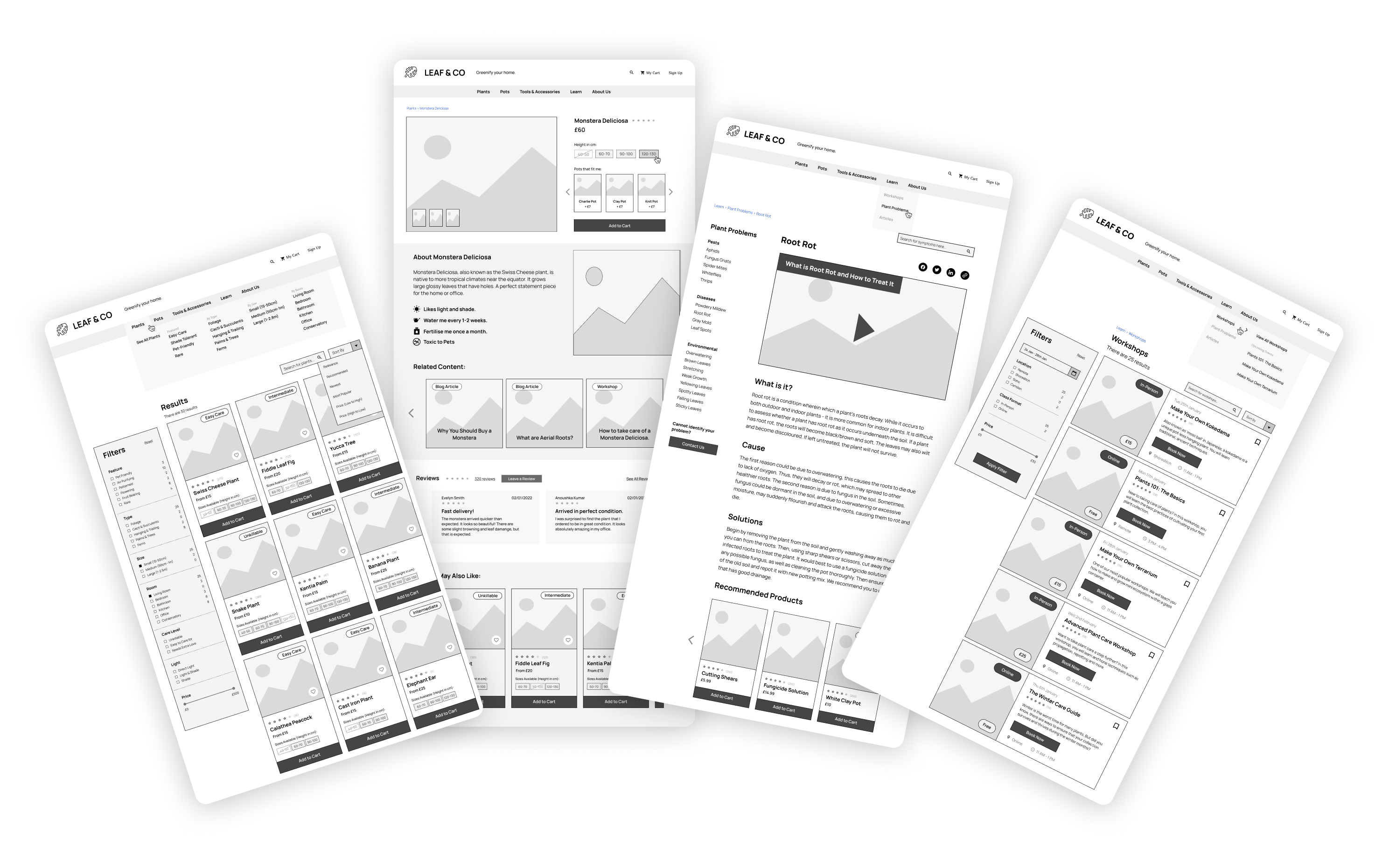
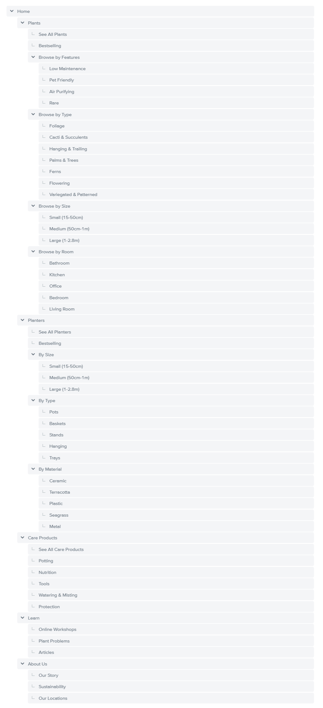
After conducting interviews and developing a domain map, I utilized Optimal Workshop to create an initial sitemap that drew inspiration from competitor analysis and my own research insights. Ultimately, I established five primary navigational labels: "Plants," "Planters," "Care Products," "Learn," and "About Us." The labels were inspired by other plant websites, and as well as the domain map. Many of the entities on the Domain have become filters for Plant search - while others have become seperate pages.
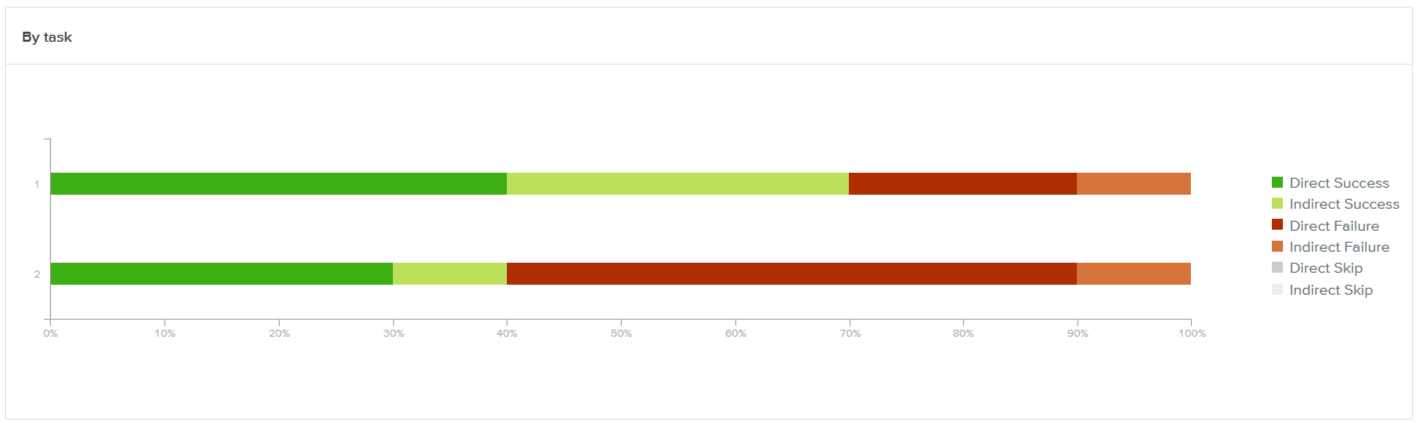
To validate the initial sitemap and assess the website's usability, OptimalWorkshop was used to conduct a usability test with 10 users who were given two tasks to complete.
You are new to taking care of plants, and you want to buy one that requires minimal care - how would you do this?
It's summer, and you found pests all over your houseplant. Where would you go to find out more about this issue?
The fact that only 40 to 70% of users completed tasks on the website means there may be things that need to be improved in the way the website is organised. For task 1, most people were able to complete tasks related to plant care products. For task 2, people had trouble finding information about pests because they looked in a different category. To improve completion rates, the website could add filters or make the "Blog Articles" section easier to find, or even create links that lead them to the right location.
Next, I conducted closed card sorting with 10 participants to help to clarify the end users’ mental models and check the degree in which the existing categories make sense.
The highlighted cells in blue show how much users agreed with how things were grouped on a website. If the percentage is over 80%, it means most people agreed. For example, most people agreed that Foliage, Palms & Trees, Cacti & Succulents, and Ferns are all types of plants. However, people were less confident about grouping things as "Features of Plants". Other things like Protection, Tools, Watering & Misting, Nutrition, and Potting were mostly associated with "Care Products" but also with the "Learn" category.
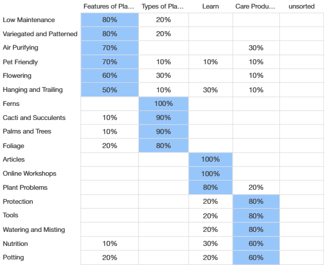
Some users found it hard to differentiate between "Types" and "Features" of plants, causing confusion when searching for easy-to-care-for plants. To improve this, we need to make it clearer what each category means. While most users had no trouble using the Learn and Care Products categories, there were some differences in opinion on how the Browse by Feature and Browse by Type categories should be organised.
In Task 1, most users followed the usual steps to find low-maintenance plants, but some did not use filters and went directly to "Bestselling" or "All Plants." Others went to the articles section for help. In Task 2, I thought users would go to the "Learn" page to find solutions for plant problems, but 60% went to the "Care Products" page instead. This means users connect learning about plant problems with finding care products, not just educational content. This indicates that there are multiple clashes when it comes to mental models.
Following the tree test and the card sorting test, I made changes to the sitemap so that it better reflects the mental model of the participants.
To make the website more user-friendly and clear, I simplified the names and eliminated ambiguity. For instance, I replaced "Planters" with "Pots" for greater recognition and changed "Care Products" to "Tools & Accessories" to make it more specific.
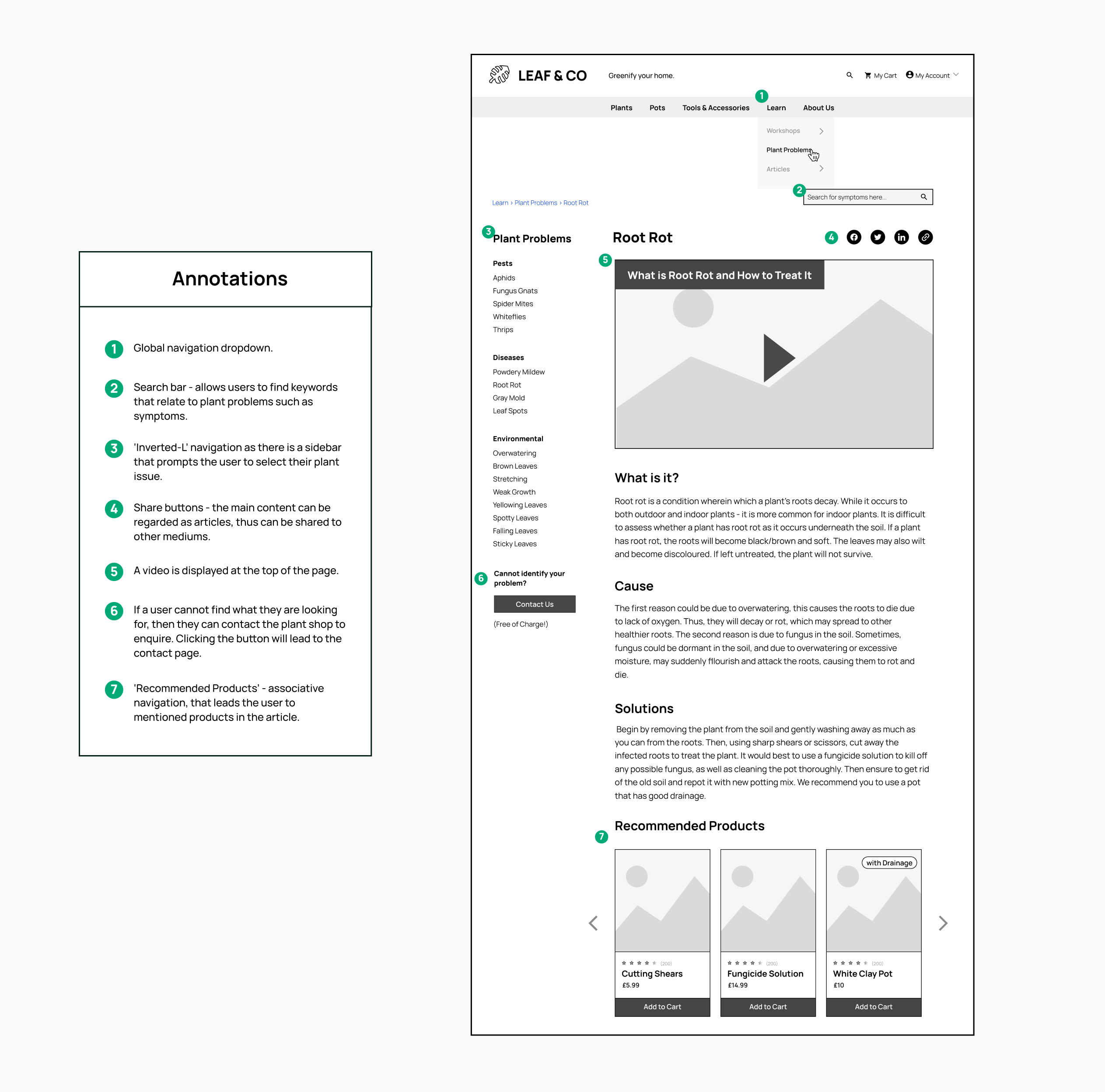
I incorporated "Recommended Products" into all product and article pages to accommodate different mental models of users, as revealed during the previous tree and card sorting tests where users took various routes to either "buy a plant" or "find a solution to pests."
Users in the tree tests had difficulty distinguishing between the "Types" and "Features" labels on the website, which may be due to the simplified nature of tree tests and their inability to accurately reflect real-world exploratory behavior of users, as well as the influence of visual design. However, upon researching similar websites, I found that these labels were commonly used. Therefore, rather than changing them, I improved clarity by making sub-categories more visible and avoiding dropdown menus.
I understood that some users prefer to search for items rather than browse through categories on the website. So, I updated the website's sitemap to accommodate this behavior and allow users to quickly and easily find what they are looking for.
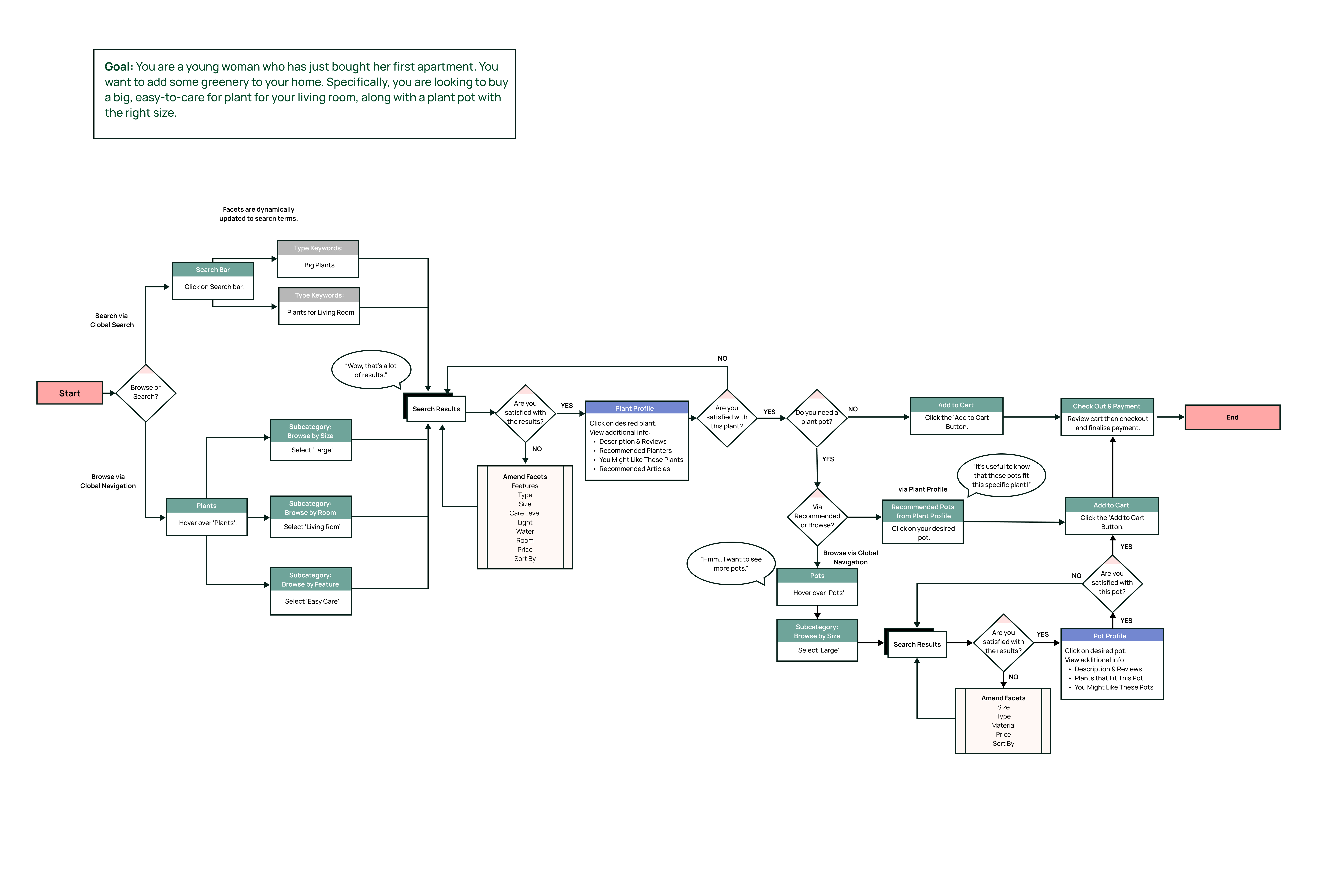
To better empathise and visualise the user flow of the newly generated information architecture, it was necessary to create user flows. The user flow is based on the context where a "young woman has bought a new appartment and wants to add greenery to her home" and is specifically looking for a "big" and "easy-to-care" plant for the living room, along with a plant pot with the right size. I included two strategies, "to browse" or "to search", making it a realistic depiction of the multiple paths a user may take. Creating this user flow helped me identify what elements should be included when designing the wireframes such as adding certain buttons "Add to Cart", a detailed plant profile - and while common sense - a "Cart" button as it is a shopping site. For designers, it can be easy to forget simple elements, so it is necessary to visualise the flow to confirm what elements are important to include.
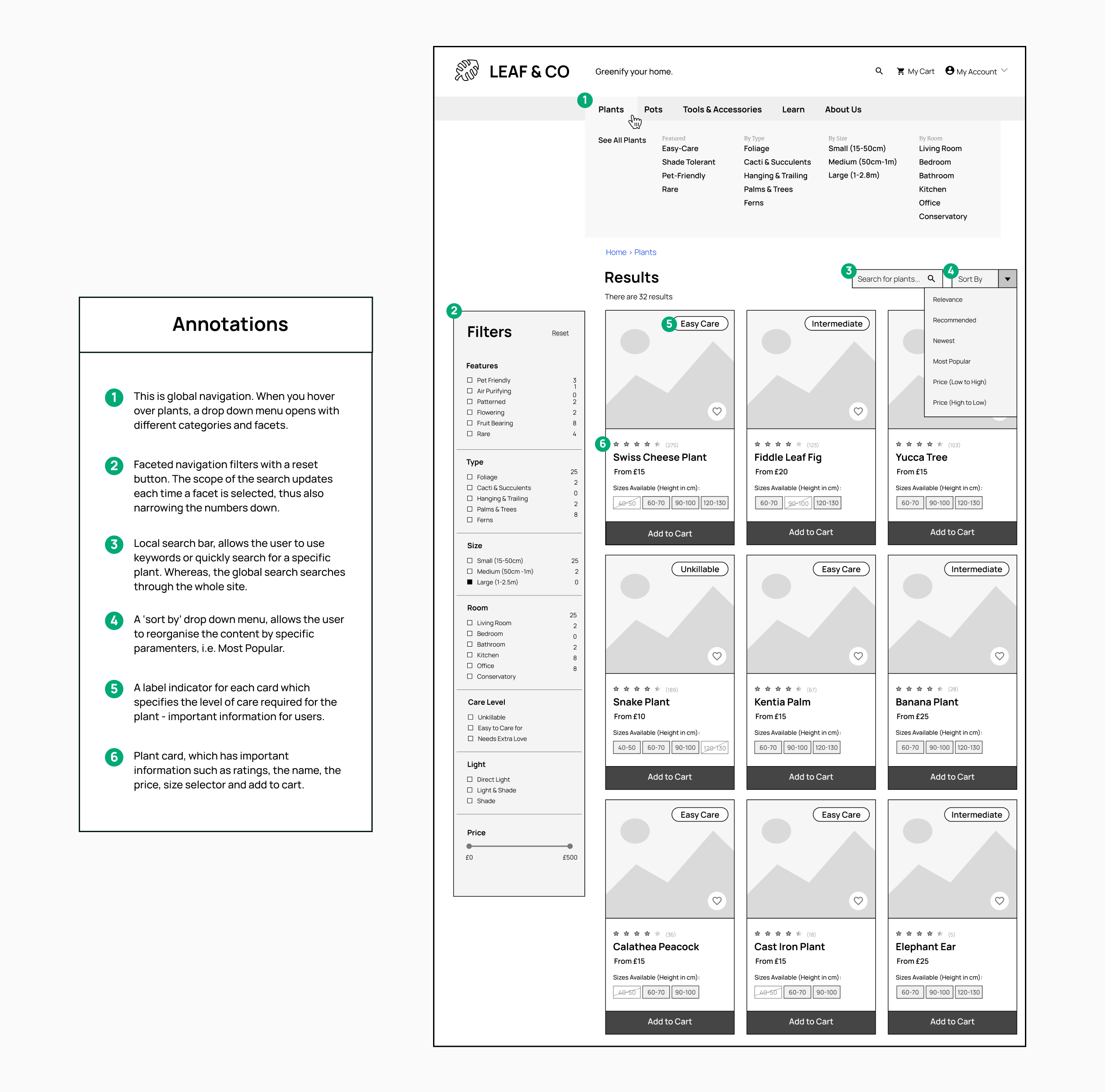
I received feedback from three plant experts on the wireframes for four key pages: search results, plant page, plant problems, and workshops. The sitemap's content has been integrated into the top navigation bar and remain consistent across all pages. A drop-down menu with sub-categories are displayed below the global navigation, and breadcrumbs have been added to help users understand their location on the site. The page layouts were inspired by competitor websites to leverage common conventions such as page structure and navigation.
One of the main issues we faced was distinguishing between the "Types" and "Features" of plants. To make it clearer, we made sure to show the subcategories instead of hiding them, so that users can easily see the difference between the two categories. Furthermoer, this page has several features that make it easy for users to find what they need. These include a mega menu displaying all categories, a faceted navigation sidebar, a localized search bar, a sorting dropdown, and product cards. The "Filters" sidebar lets users include or exclude multiple facets, and each plant card has a unique 'size' selection option to reduce pogo-sticking. Pogo-sticking is when users quickly return to search results after clicking a link that doesn't meet their needs.
Feedback from Experts:
Although mega menus are helpful in houseplant domains to prevent hiding options and maintain information scent, users found the dropdown menu overwhelming and certain important facets were omitted. To address this issue, I removed the "By Features" category and instead created a "Featured" sub-category with the most frequently visited facets.
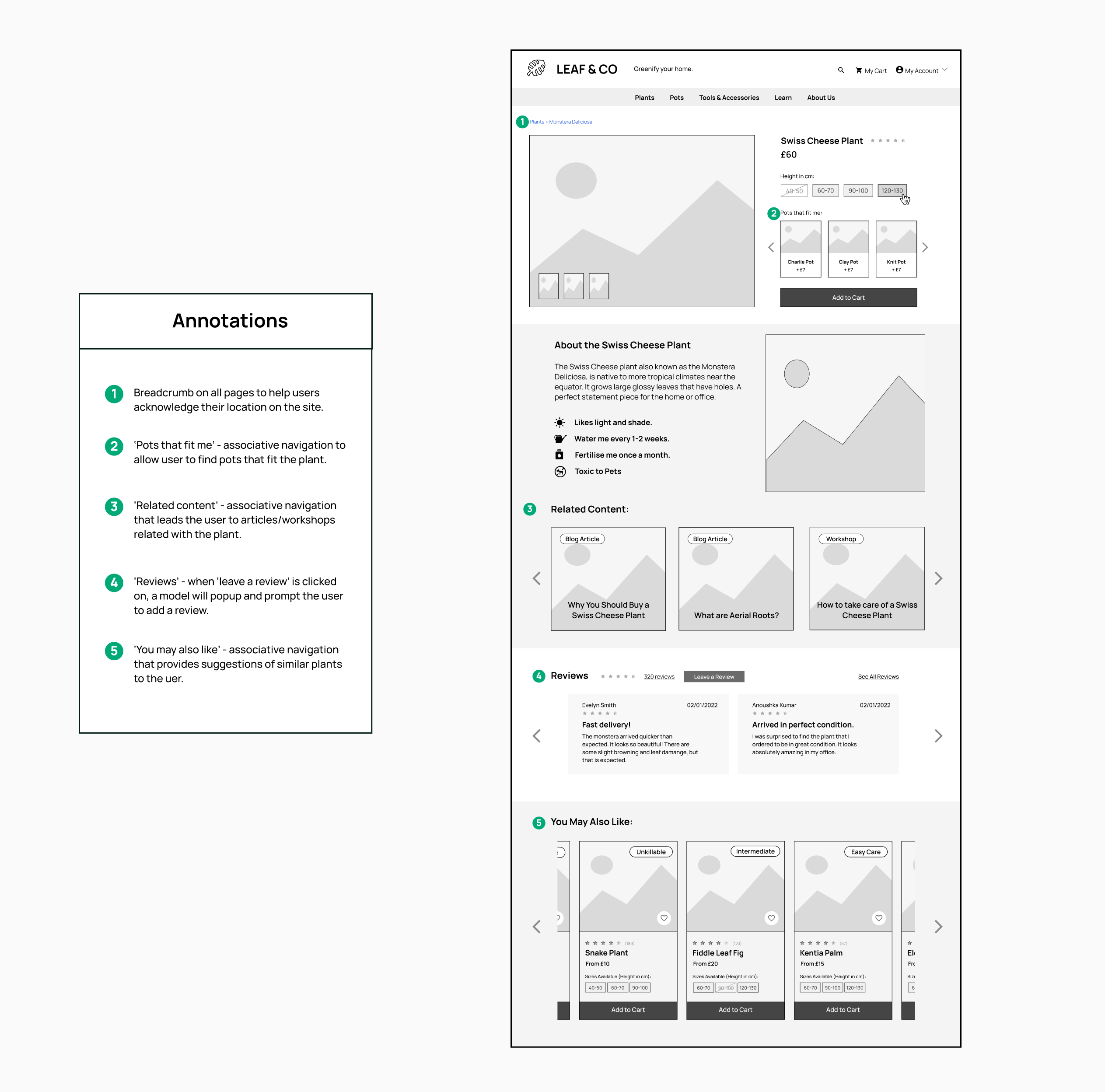
The plant profile is a valuable resource for users as it provides in-depth information about a specific plant and can be helpful in making informed purchasing decisions. Additionally, it facilitates navigation on the website by providing links to related articles and other plants. Making it effortless for users to locate the information they need is crucial for boosting revenue.
Feedback from Experts:
Based on user feedback, we made a change by renaming "Add a Pot" to "Pots that Fit Me" to better convey that the section is intended for purchasing complementary pots.
The page has an 'Inverted-L' navigation with global navigation at the top and local sub-navigation on the left. The local navigation lists common plant issues, and when selected, displays content with symptoms, solutions, and suggested care products. The local navigation aids exploratory browsing, and the search bar allows users to search for symptoms. Share buttons are also present.
Feedback from Experts:
However, one issue highlighted during user testing was the lack of options if the user couldn't find the problem they were looking for. To address this, a Contact Us button was added, redirecting the user to the Contact page to send an email or call customer service.
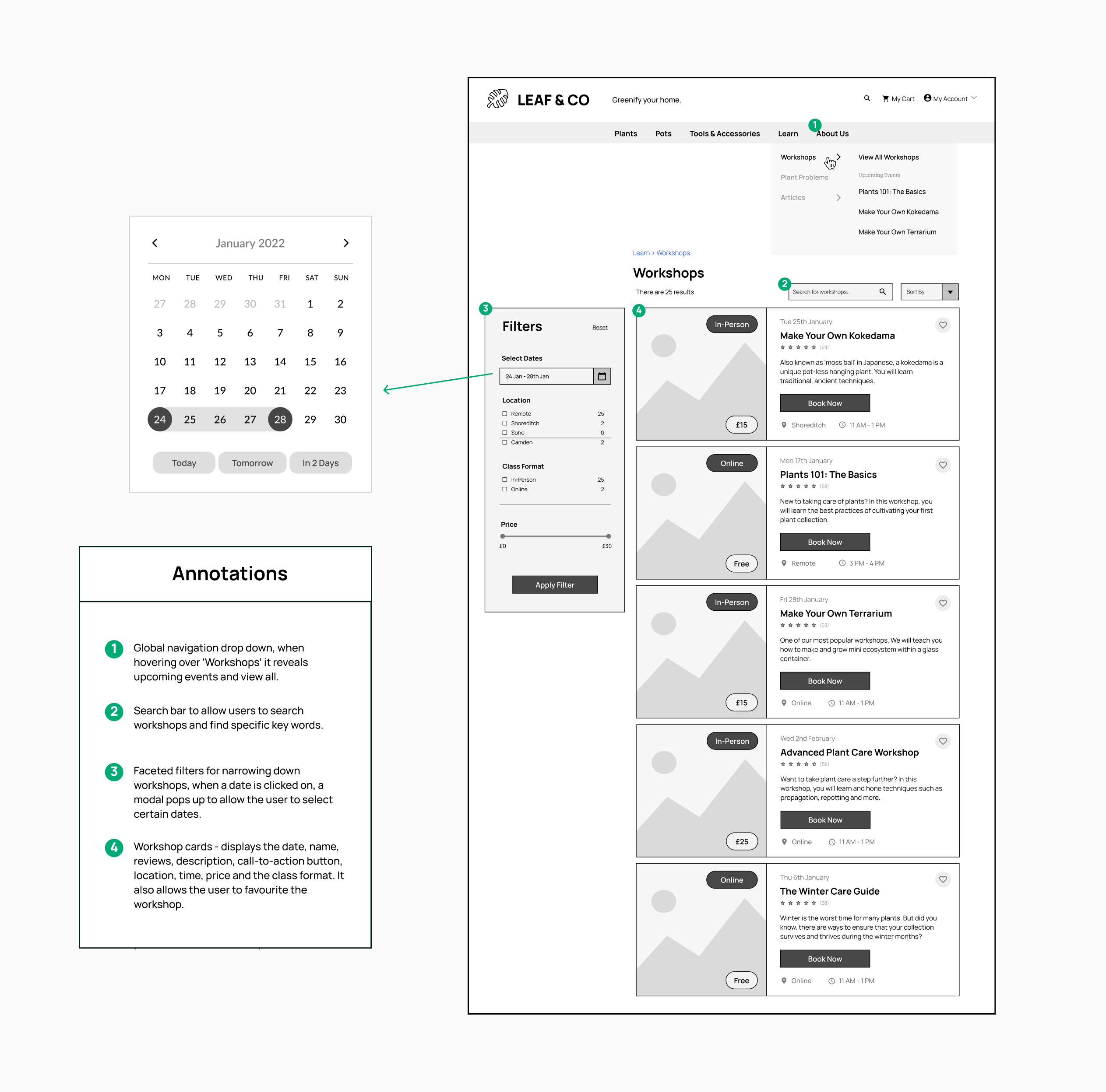
The Workshops page, accessed from the Global Navigation, helps users find and join Leaf & Co's workshops. Since the page requires specific facets (like location, date, and class format), a drop-down flyout menu is used.
Feedback from Experts:
During the reviews, it was found that the original drop-down menus caused a problem as users couldn't select multiple options. So, checkboxes were used instead to increase visibility and provide more control over re-ordering information, leading to better decision-making and accuracy.
Conducting domain expert interviews, tree testing and card sorting helped me to acknowledge the mental models of users when it came to navigating an online plant store. This laid a foundation on the design of a sitemap for such website, which eventually led to the designs of wireframes that included navigational elements such as faceted filters, search bars, sorting, navigation bars - to aid users in finding either a product they want to buy, help for a certain plant issue, or generally find articles they are interested in. As a result, I have produced wireframes that can be further tested through usability testing, and move on to higher fidelity designs.
A successful information architecture matches user mental models - and allows for error recovery. This project provided me experience in using industry tools such as OptimalSort to create IA-related activities such as tree testing and card sorting to confirm mental models related to plant e-commerce sites. Metrics such as a "first-click" tests and "direct" / "indirect" user journeys, and finding problematic touchpoints.
It can be difficult to make sense of complex relationships between different topics, thus, learning to visually depict these relationships helps me to better understand them. I learned how to create user flows, detailed sitemaps, and domain models. Not only has it been helpful in interpreting ideas, but one could imagine it being extremely helpful for other stakeholders such as developers and other designers within a team. Thus, improving collaboration and teamwork.
While the initial research succeeded in providing the mental models of users, and thus better informing the wireframed designs. It would also be beneficial to do a more in-depth usability testing session to see whether users can easily navigate and find the pages they need. I conducted a brief review session with plant experts, however it may have not been enough to fully evaluate the usability and navigability of the wireframes.
Reflecting on my IA research process, it would’ve been beneficial if I had supplemented my tree and card sorting tests with additionalpost-interviews to provide more justification into their mental models and obtain an explanation to some of the failed tests.