.png)
Finding an opportunity for users to leave a digital 'footprint' in a public park space.
Our team in the MSc HCID 'Interaction Design' Module at City, University of London worked on a conceptual project called ParkNav. The project aimed to encourage users to leave their digital footprint in Regent's Park, a popular outdoor leisure area, by exploring how technology could integrate with people's experiences in public parks.
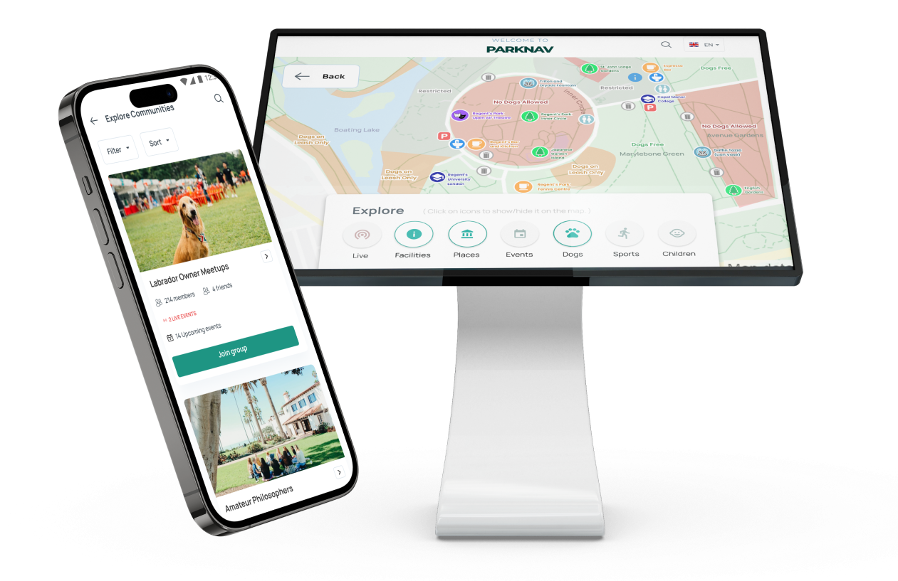
Introducing ParkNav - a mobile-kiosk technology that transforms the way we interact with public parks. Users can access a map, join communities, book sports pitches, and create live notices. This empowers users to leave their digital footprint and connect with other like-minded park-goers, turning the park into a vibrant community hub.
With an open-minded approach, our team was determined to gain a deeper understanding of the visitors to Regent's Park. To achieve this, we conducted on-site observations and 11 guerrilla interviews with random park-goers to gain insight into their motivations, pain points, and habits. Our objective was to uncover opportunities for introducing technology that could enhance visitors' experiences in the park. We gathered valuable insights from our in-person interviews with locals, joggers, and students.
To observe a diverse range of park visitors, each member of our group conducted individual visits to the park on different days and at different times of the day. Our observation sessions, ranging from two to four hours each, involved noting various details, such as the demographics of people in the park, their activities, and the tools and resources available to them. We paid particular attention to how people were interacting with each other, the physical maps in the park, the technology they were using (if any), and what they had brought with them.
As a group, we reviewed our findings and identified key themes that emerged from our research. Below is a summary of what we found:
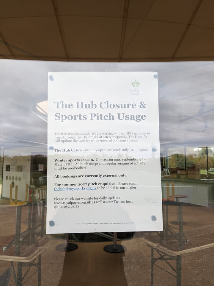
It was difficult to find information about sports pitch opening and closing times and how to book activities. A park worker was unable to help, and the sports building had a sign saying it was closed, with another sign mentioning external bookings, which left us confused.
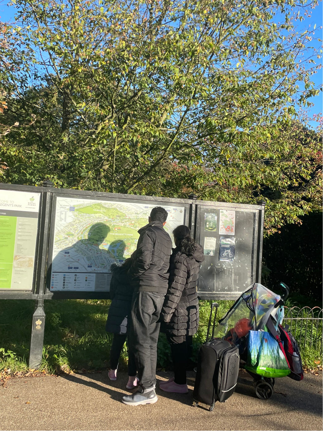
Regent's Park has map stands with a larger map to show visitors their location and information about events. During my observation for 2-3 hours, I saw a family of tourists and an old woman who were confused by the map. They found the words too small, too much information, and had difficulty finding things.
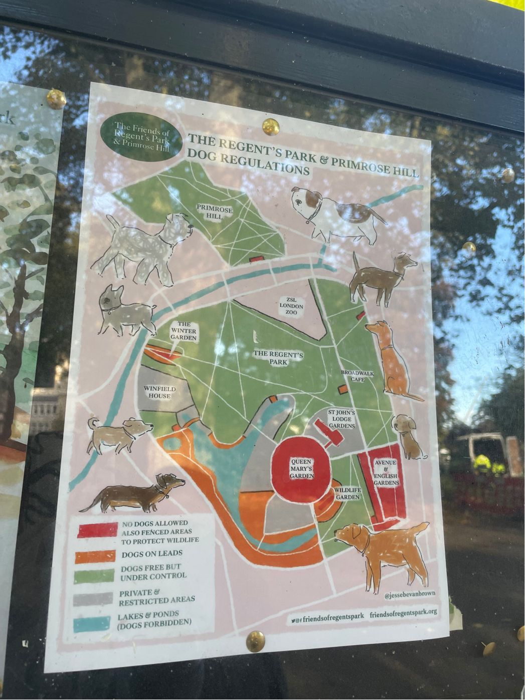
Regent's Park is a popular spot for dog walking, but finding out where dogs can and cannot go is tricky. There's a noticeboard, but it's not very accessible, and people may have trouble remembering the rules while walking around the park (like keeping dogs on a leash near waterways, roads, and during deer birthing season).
People often use parks to gather with family, friends, or small communities. The free roaming nature of park spaces also makes it an ideal meeting location for various activities such as yoga lessons, photography workshops, concerts, and more. Our interviews and observations revealed that Regent's Park is a primary meeting place for outings, particularly with London Zoo nearby.
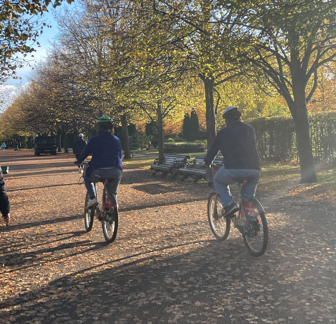
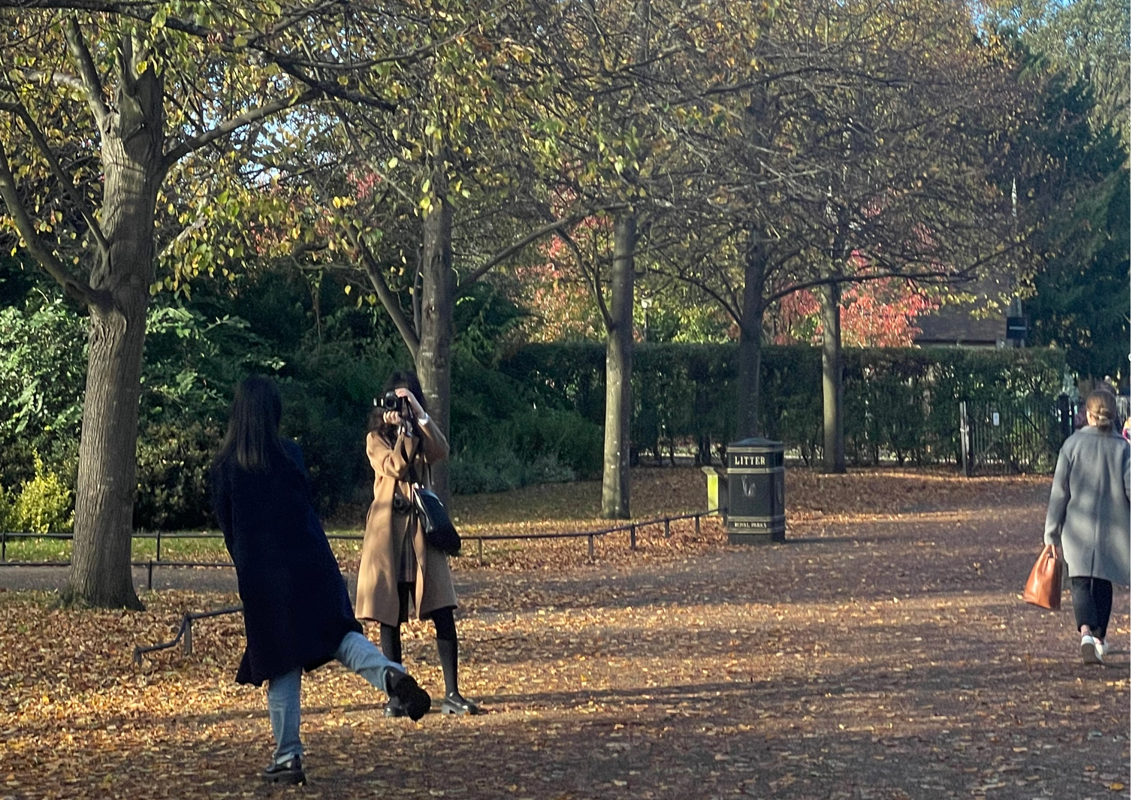
People visit the park for various reasons, such as enjoying the beautiful scenery or having a leisurely lunch on the benches. During Autumn, many come to see the colorful trees and take photos. We must ensure that any technology implemented does not interfere with nature as it will spoil the purpose of why people come here in the first place.
After brainstorming various ideas, our team settled on creating a portable kiosk system that incorporates our collective concepts, including QR codes, real-time maps, and mobile devices. By strategically placing kiosks throughout the park, visitors can easily access the same system via a mobile app. By digitising noticeboards, it allows for real-time updates, portability and additional interactions that help enhance usability. This approach caters to users' needs, allowing them to engage with the park community and book sports activities without disrupting the park's natural beauty.
A mobile-Kiosk system to replace conventional park noticeboards
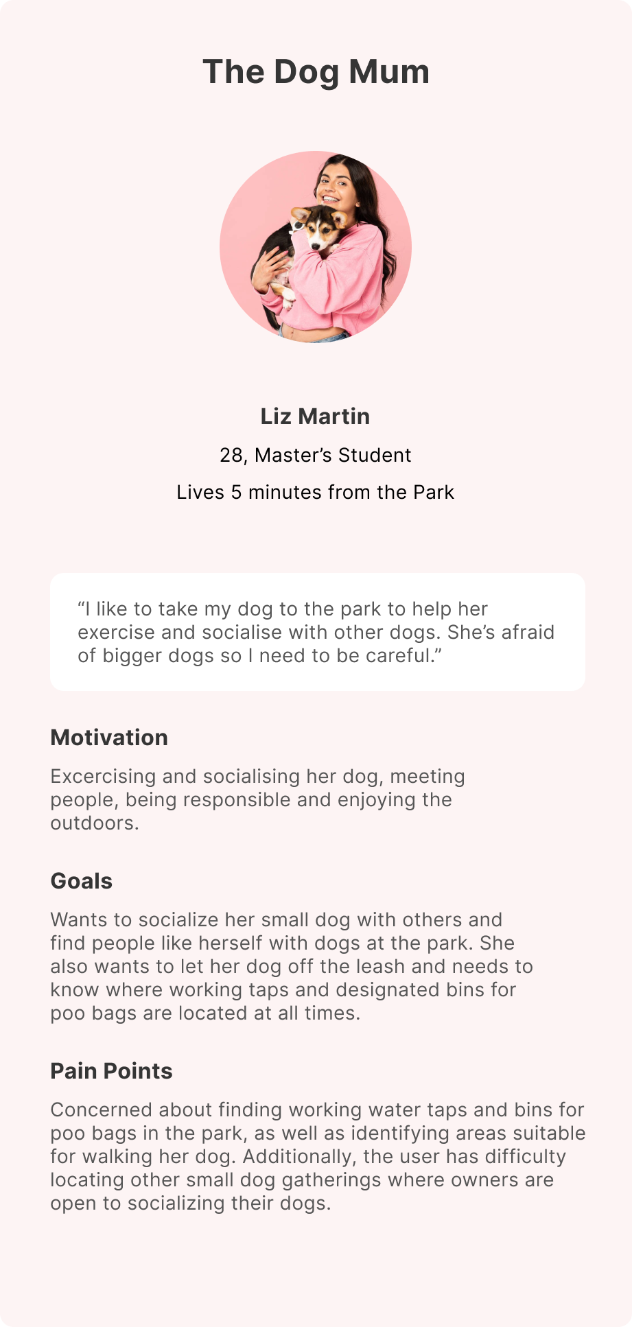
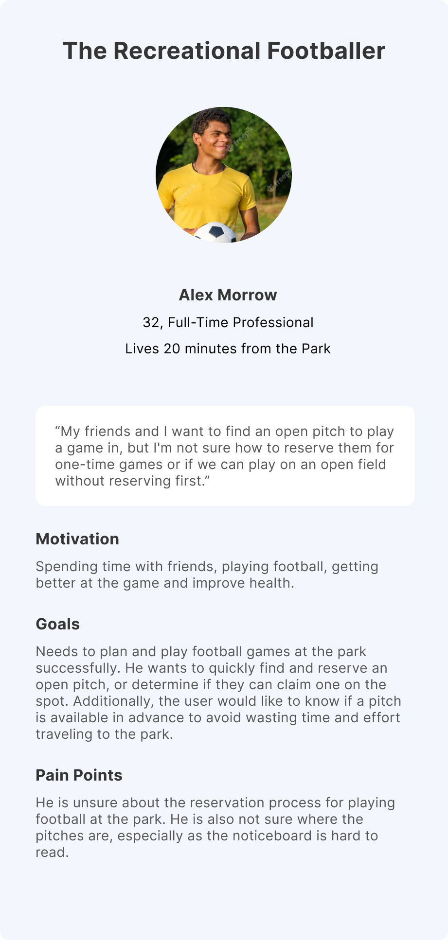
We wanted to bring our concept's focus back on the user by creating two personas - Liz Martin and Alex Morrow. These personas represent common visitors to the park and help us better understand and empathize with their needs during the design process.
Liz is a student who wants to meet other dog owners while taking her dog to Regent's Park. She wants to know if there are any small dog gatherings and locate off-leash areas, water taps, and bins. However, the park noticeboards are overwhelming, and she struggles to find the information she needs.
Alex is a working professional who loves football. He wants to book a football pitch at the park to organise games with friends but is unsure how to do it.
The user journey map helped us identify the specific needs of each user:
Dog walker needs to easily find dog communities, off-leash areas, and dog-related spots on the map, as well as locate waste disposal and water refill stations.
Recreational footballer needs to easily book pitches, know the available schedule, navigate the pitches easily, and understand the booking process.
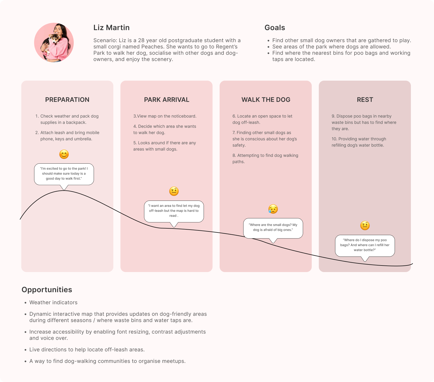
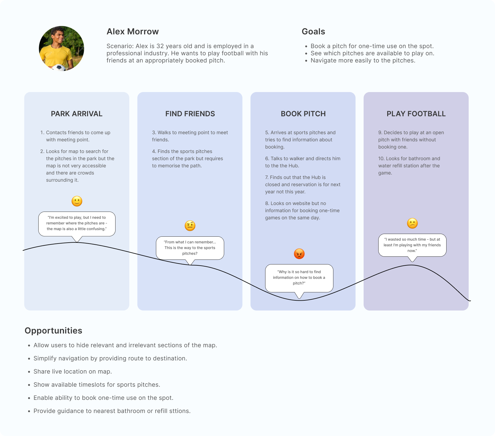
Both personas looked for specific areas in the park such as off-leash dog zones and sports pitches that are not easily found on Google Maps. This highlights the need for an accessible and straightforward way for users to locate different areas within the park, instead of relying on confusing noticeboards.
Parks are social places where people seek to find others with similar interests. Dog walkers want to find small dog owners, and footballers want to locate their friends. This highlights the need for technology to facilitate finding friends and joining local communities.
Park noticeboards are challenging to use due to small font size and an overwhelming amount of information. They don't dynamically update and aren't portable, which makes it difficult to access the latest information. Using portable mobile devices is a more accessible and convenient alternative to ensure users don't miss important details, such as how to book sports pitches or where dogs are allowed off-leash.
We created "How Might We" statements by identifying user needs during user journey mapping. We framed each problem into how we might address the issue. As a result, we brainstormed multiple solutions. We combined similar ideas and eliminated redundancy to create a more refined set of solutions. We discovered that we had many shared concepts.
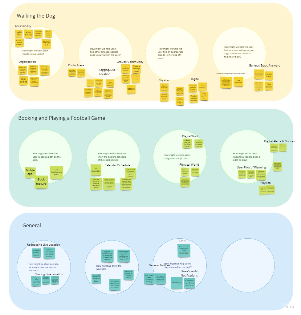
The Problem: Can be difficult to stay updated with live info such as friends, activities or notices.
Solution: Live indicators enable users to have real-time information about the park's conditions, helping them find nearby communities, and find friends.
The Problem: Hard to find specific locations because noticeboards are crowded with information.
Solution: We realised that each parkgoer has varying motivations. ‘Filters’ allow users to pick and choose which filter is relevant to them.
The Problem: Hard to keep up with all the daily activities and events in the park.
Solution: Main motivations to go to the park are communities - dogs, sports, special interests, etc. This allows parkgoers find likeminded people.
The Problem: Unclear on how to book and play sports in the park.
Solution: A sports booking feature that shows availability through a calendar would visually aid users in finding the best time and place to play sports.
The Problem: Hard to read static noticeboards because it is only in English, and the font sizes are tiny.
Solution: Offer multiple language options and have better accessibility for fonts (larger size, better contrast).
The Problem: Google Maps does not support in finding specific areas of the park.
Solution: Enable live direction support through the map. Particularly for areas that are not supported by Google.
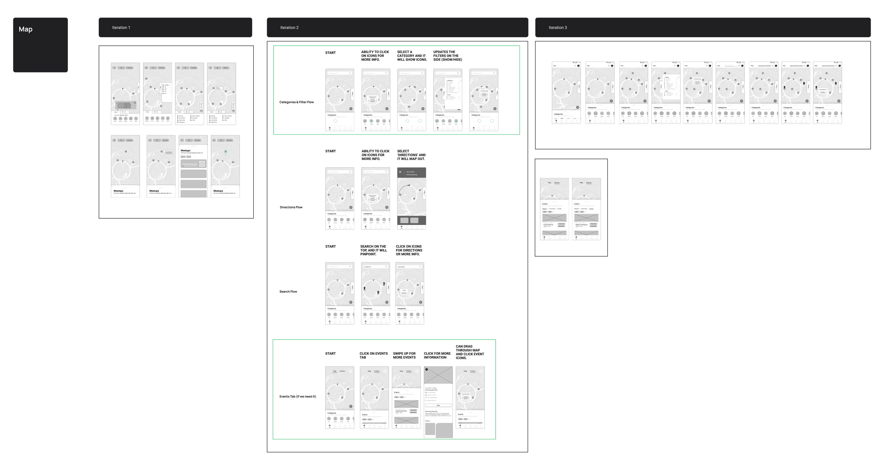
We began with sketches because they are quick to make and require low commitment. This allowed us to create lots of sketches based on different ideas before narrowing it down. I created the first row of sketches, which illustrates possible appearances of the kiosk, the homepage, booking and how the map would work. These helped the team better visualise potential designs, and allow us to pick what might be a good idea.
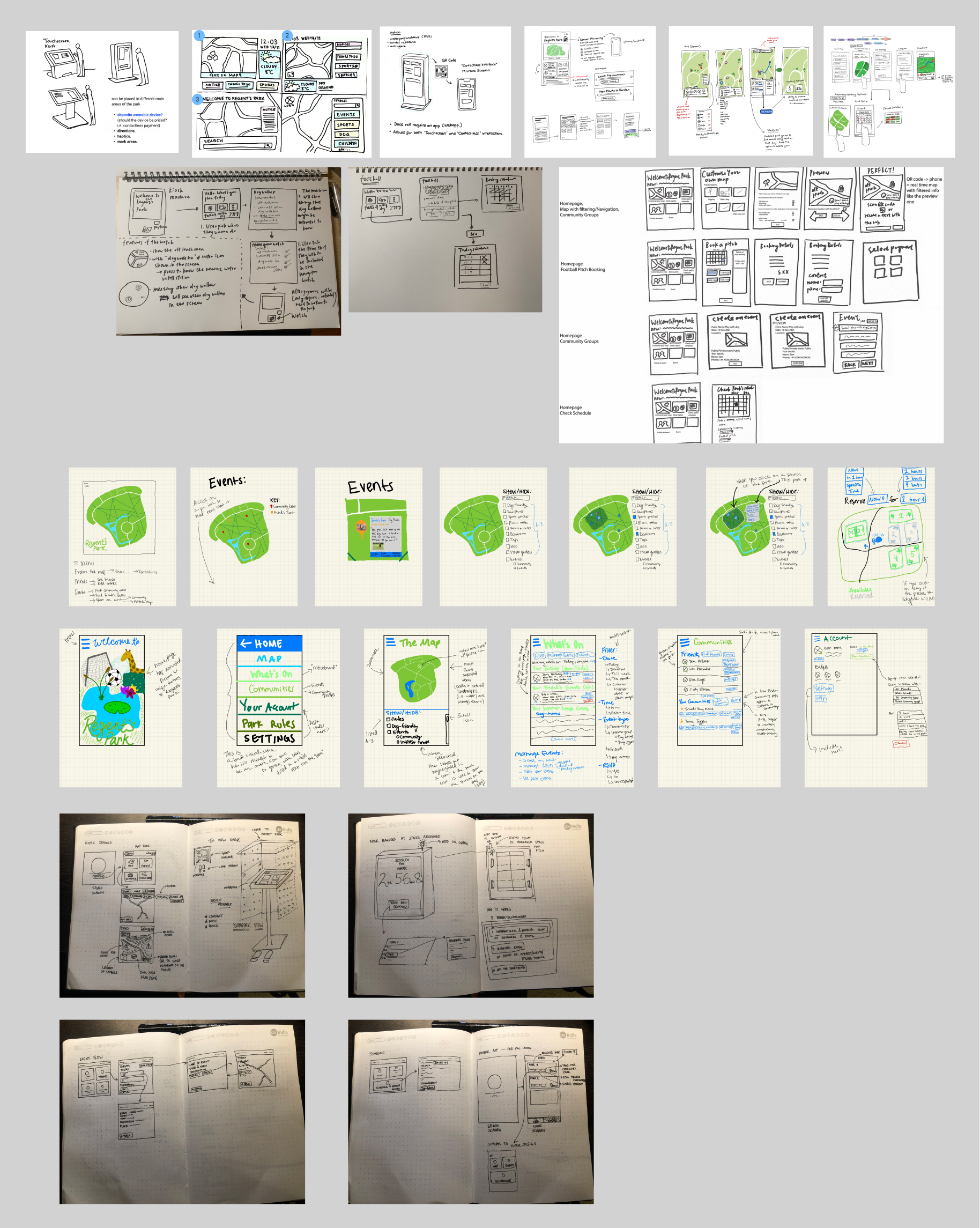
We assigned each team member to design a specific page using Figma, resulting in the creation of four pages: Map, Communities, Bookings, and Events. Through critique workshops and feedback, we iterated designs over two rounds of wireframes. I volunteered to design the Map feature, creating rough drafts of four primary user flows in the first iteration: Filter Selection, Directions, Search, and Events Tab.
The most notable iterations:
1. Omitting a "Live" tab and including it within "Categories", as it offers the same purpose of showing and hiding icons.
2. Simple 'Plus' button to indicate that users can add their own live alerts.
3. Creating two tabs "Map" and "Community" (But will soon be removed due to communities and friends being grouped together in "Socials" at the bottom navigation bar).
We created two to three iterations until we were happy with the design.
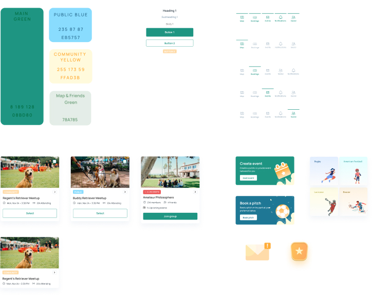
Now that we had a rough outline of the layout and positioning through our iterated wireframes. It was time to add colours and finalise the visual appearance of the designs. We applied three main design principles - Design Consistency, Psychological Principles, and Accessibility - to finalize the visual appearance of our designs. We used recognizable symbols and color-coded tags for event types to maintain consistency, applied rounded edges on buttons and images to follow natural eye movement, and ensured appropriate contrast and sans-serif fonts for readability and ease of use. Additionally, we used large buttons with text for discoverability and ensured controls were operable with one hand.
To ensure that our design maintains consistency, we created a design card to document our key style elements, and we also developed future user journeys to serve as a reminder to consider our personas' needs during the design process.
We evaluated our prototype by conducting in-person observations while participants used their mobile phones to perform tasks on the app. We recruited six participants, including three young adult males, a middle-aged couple, a young adult woman, and a senior software engineer with industry experience. We assigned 12 usability tasks for the mobile app and 4 tasks for the kiosk, covering all app pages.
Tasks included finding nearby facilities, booking a pitch, joining a community, and filtering events. We observed participants' interactions, noted their comments, and recorded any issues they encountered.
The majority of the suggested changes were implemented, except where changes contradicted other results or where there was a stronger design justification for not making the change. After making these modifications and conducting a final review of the app designs, the team approved the final app design.
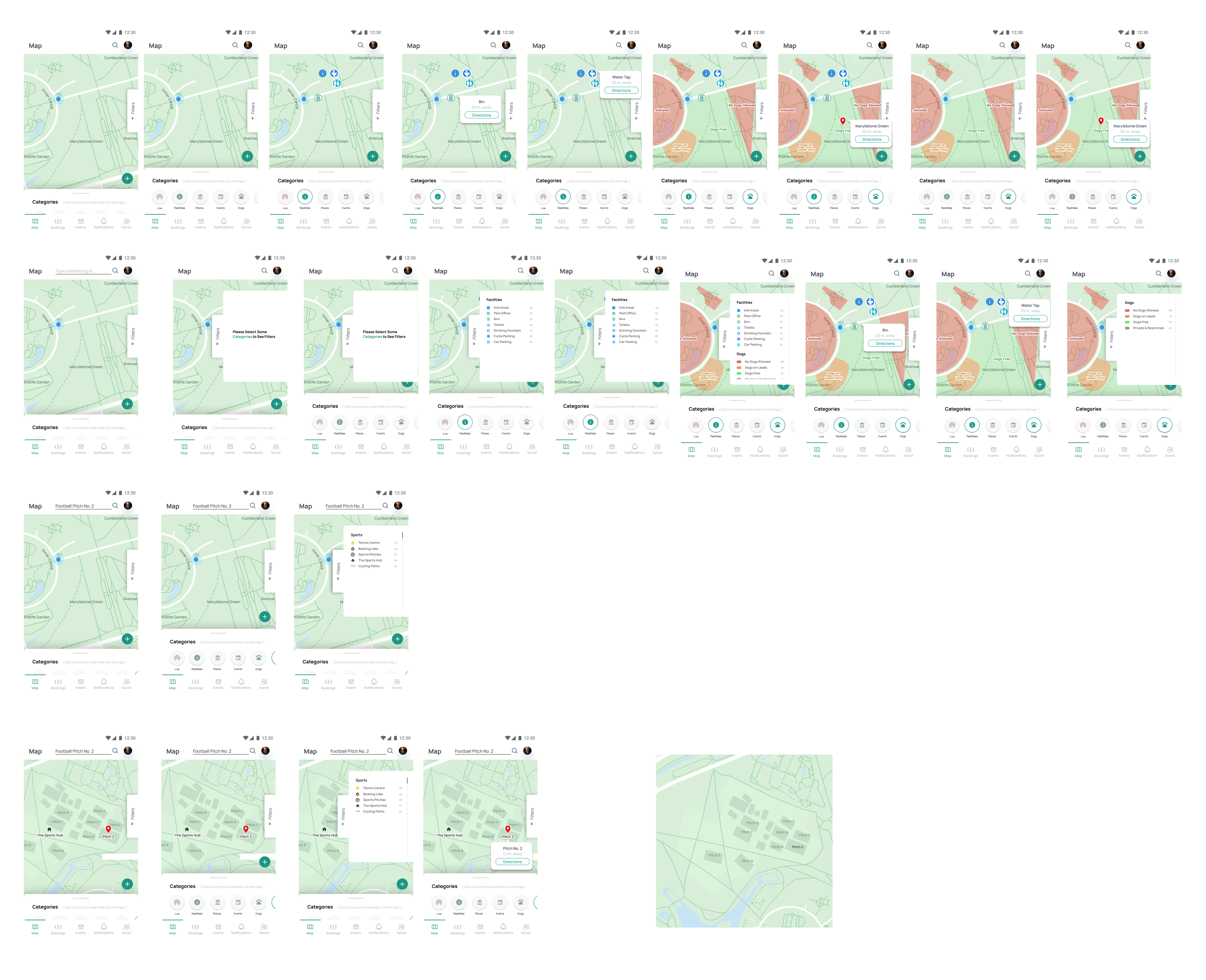
Surprisingly, users found the "Filters Legend" sidebar unnecessary during testing, preferring to interact directly with icons. Some were unclear on the filter feature's function. To simplify the interface and reduce clutter, we removed "Filters Legend" and kept "Explore" categories at the bottom of the screen.
While most participants figured out how to use the map, some users were quite hesitant. Thus, to clarify to users, we decided to include "Tooltips" when the user first uses application. Tooltips provide explanations on how to use the application. Furthermore, I amended the map so that "Categories" were pre-selected for "Places" and "Facilities" as these are the most common use cases - helping the user save time from pressing the buttons.
We changed "Categories" to "Explore" because it was unclear to users what categories implied, so "Explore" may better convey to the users of what they should do - which is to explore. For the booking page, it was changed from "Pick your Pitch" to "Continue" because users were confused if they needed to pick a pitch on the initial booking page.
We also added and modified additional aspects like having "red" or "green" indicators when booking pitches to convey availability. An "Add to Calendar" function, booking references and an option to send to their perosnal email. And also an bility to invite friends to other pages. Otherwise, there were a range of other minor prototyping issues.
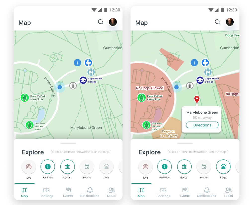
Noticeboards are overwhelming with information. Therefore, as a solution, we implemented ‘Filters’ wherein users can pick and choose which filter is relevant to them. Users can choose as many as they need. Users can also click on map elements to interact with them - it will open a bubble which prompts the user to choose an additional action.
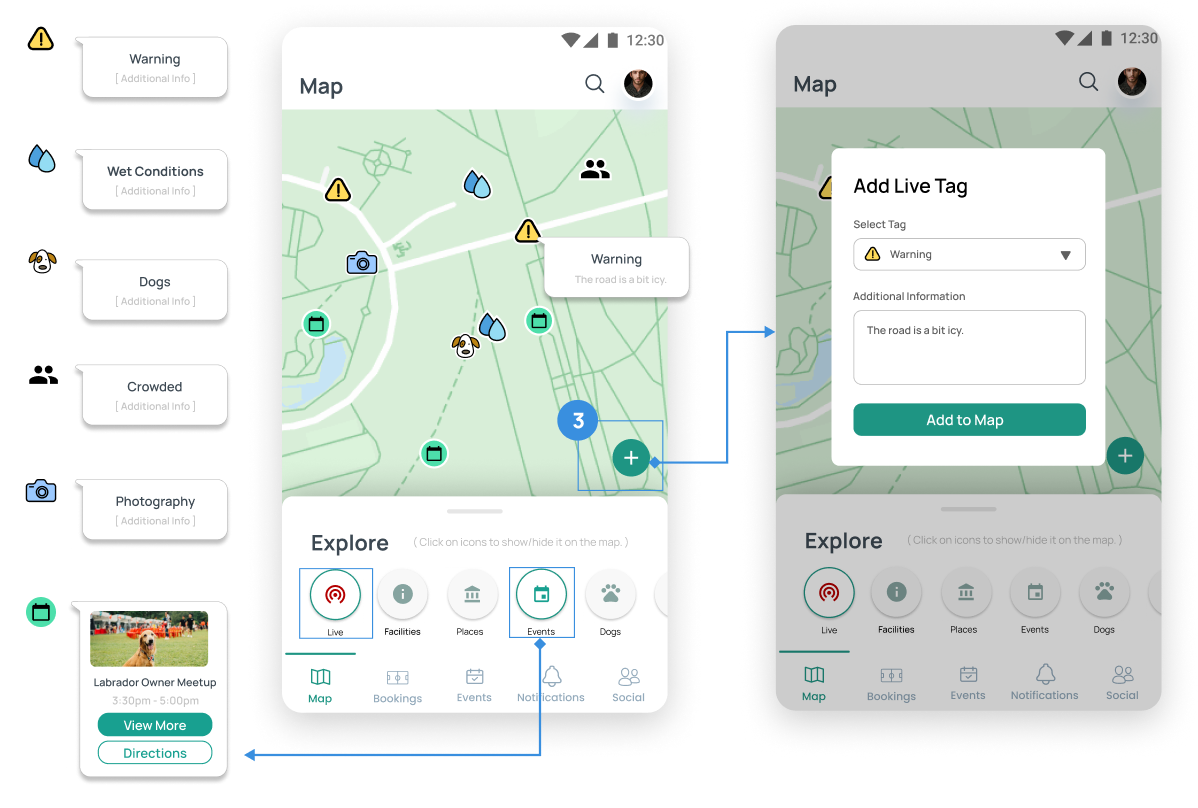
This gives users real-time information about the park's conditions, helping them make informed decisions. It's inspired by Waze and lets users add and view tags that can change day-to-day. The tags can include warnings, weather conditions, photos, dogs, and crowdedness. This allows users to leave a "digital footprint" as per the brief.
.png)
We debated what we should call this page - after testing out different names on a couple of people, we decided on “Social”. Via the tabs, users can switch between the “Friends” and “Communities” tabs in the Social page by click on either option. Users can add friends from their social media accounts or find communities that pique their interest.
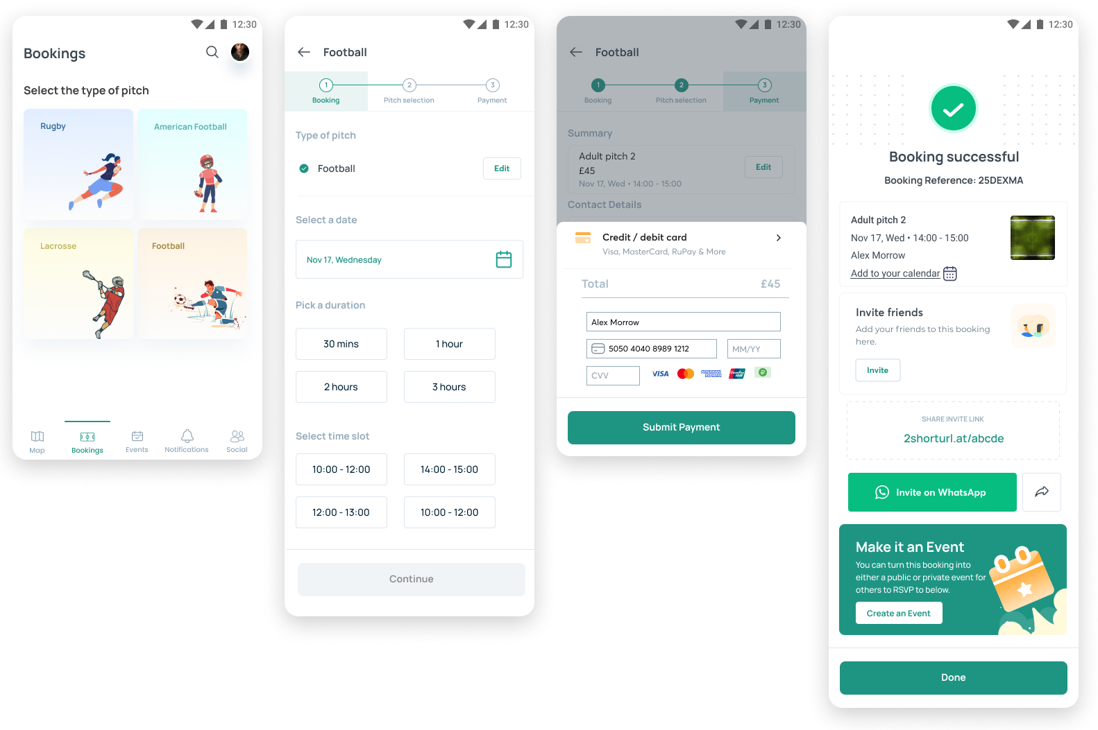
By clicking “Bookings” in the bottom navigation bar, it will bring you to the main bookings screen, where you can book through the “Book a pitch” button and see the details of your current reservation under “My bookings.” Users can choose what type of sports, which pitch, what date, times, availability and then pay by the end. Once booked, users can easily invite friends or share the link.
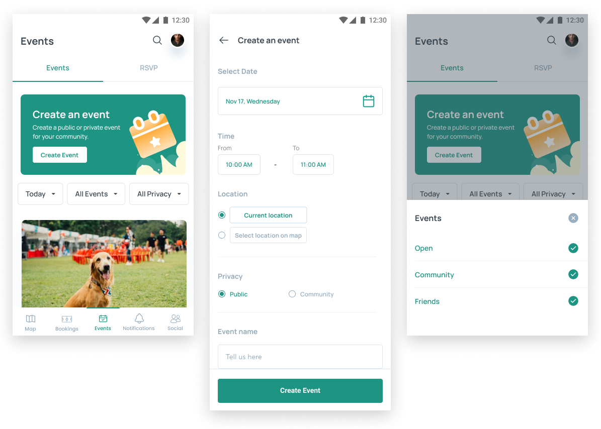
The events screen is categorised into two sections: Events tab which has the primary card element to create an event, filters for viewing events, and a list of all the events in chronological order. RSVP tab displays all the events which the user has RSVP’d to (said he/she would attend). Users can filter by either private events or public events. Private events would be invite only or through a community group (to members only). These events would not be shown to those without an invite. Public are shown to anyone.
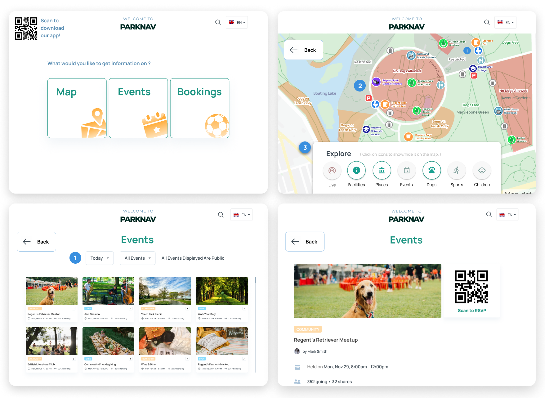
The Kiosk can be used by itself, or in collaboration with the app. Users can use the kiosk to use the map, search events, book sports - and have the choice to scan QR codes so that it can be connected straight through the app. Additionally, the Kiosk has a language-changing option to cater to users who come from different parts of the world as London is so diverse.
To innovate a new feature or technology, it is important to root ideas based in reality through researching real user needs rather than assumptions. So, through doing "in-the-field" research, I was able to get a better grasp of the public space, and how people interact with it. Through speaking with real users, and observations, I was able to brainstorm creative ideas compared to just making ideas from the comfort of my own home.
When making changes to designs or ideas, it is important to archive them or documenting the multiple versions of iterations. By keeping in track of these past work, it is easy to reflect on past designs and compare to the current designs - which will be useful in justifying design decisions to stakeholders.
This project involved working with a team of 3 other people, who began as strangers but later became my friends. Working as a team involved synchronising schedules, delegating work, and providing mutual support. In the end, we made sure to have good team morale and communication through the use of Notion and Slack. Most importantly, ensuring everyone has their say, and resolving any conflicts.
At every stage of the coursework process, we used various tools to keep track of our information and decisions. We used Notion to take meeting notes, list upcoming deliverables (our “homework” to be done prior to our next meeting), keep track of our user observations, store links to other important resources, write down ideas and decisions, detail interview questions and evaluation tasks, store user evaluation results, and serve as the “source of truth.”